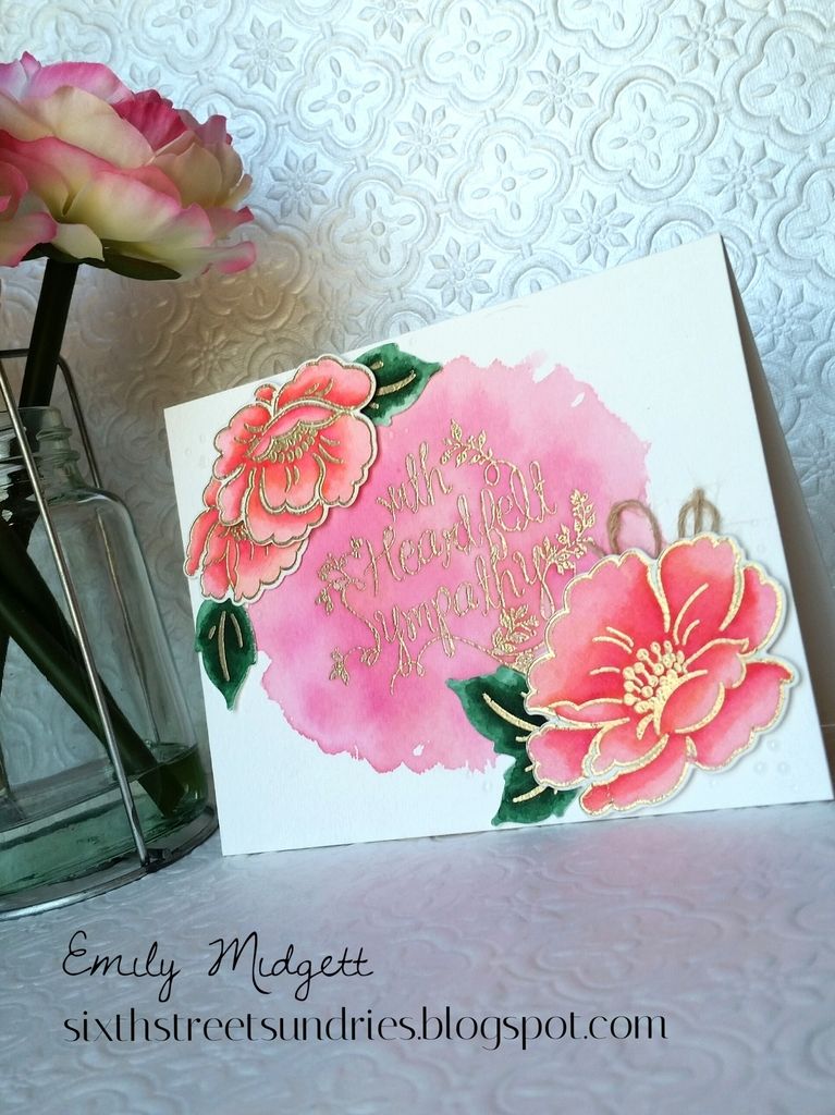
Today's card focuses on the beautiful sentiment from With Heartfelt Sympathy from Stampin Up!. It has a decidedly summery color scheme, because when I made it, it was still quite summery outside. I think it would look lovely in a more autumnal color scheme.
Now, I've always been a little afraid of SU! simply because I'm a photopolymer kinda girl, and the idea of not being able to see where I was stamping kind of terrified me. I had heard that SU! recently started a photopolymer line, and I found a lovely woman nearby who sells SU! and placed my first order. I wasn't disappointed. Part of what attracted me to this set, other than the lovely, heartfelt, non-schmaltzy sentiments was the absolutely beautiful typography. I'm a sucker for gorgeous fonts, and when paired with beautiful, simple, useable sentiments, I'm all over it.
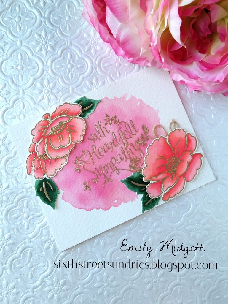
I thought this sentiment would look gorgeous combined with watercolor, and so I dug out my under-utilized Gansai Tambi watercolor set to create the color wash for the background. After heat embossing my sentiment with Princess Gold on some Strathmore watercolor paper, I used a shade of pink and orange to create the kind of melon-y color wash behind the sentiment. I don't like to use a lot of embellishment or fancy design on sympathy cards, so I decided to use a few blooms from the Papertrey Ink Vintage Blooms set. I heat embossed them on the same Strathmore watercolor paper and die cut them with the coordinating dies. My trusty Zig Clean Color markers were put to use on the blooms and leaves, since I don't quite trust myself watercoloring with actual watercolors and being able to create any kind of depth or shadows. (I know, practice, but who has the time to practice?) For the leaves, I simply die cut them, then heat embossed just the center lines to indicate the center of the flower in gold EP. I wanted the color to bleed all the way to the edges of the die cuts, so I didn't add any of the other images included in the stamp set for the leaves.
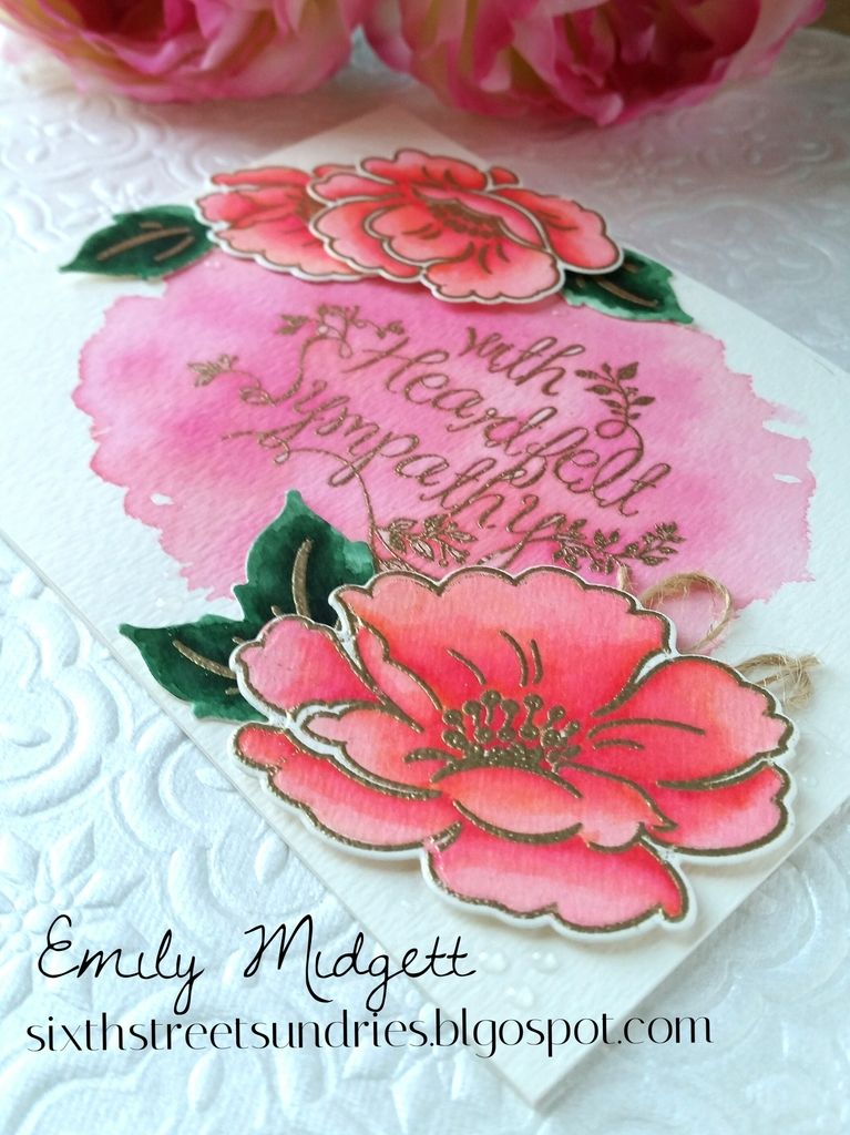
I popped up the die cut blooms to add some dimension to this fairly flat card. For the finishing touch, I added a few drops of Glossy Accents to emulate dew drops, and then I added a twine bow peeking out beneath one of the blooms.
I hope you enjoyed! :) Have a fabulous weekend, friends!
No comments:
Post a Comment