Monday, August 31, 2015

SAF 2015 Twine challenge

This is officially my last SAF post. I like twine... Sometimes. I like the texture and dimension it adds, but it is a little rustic for my taste for the most part. I do, however, like twine bows all the time. I think they are super cute... Especially when there are balloons involved. I hadn't had a chance to use my balloon shaker dies yet, so I busted them out and made a cute little shaker card using some patterned paper from the Shakers and Sprinkles kit. Some Glossy Accents and sequins added a little sparkle.

I apologize for the poor lighting in the photos... 10 at night isn't the best for photography.

I now declare Stamp A Faire 2015 finished! For me, at least. Back tomorrow with some exciting news and another fun surprise!!! :)

SAF 2015: Make It Work

Yes, I'm still working on SAF stuff. Those pesky, adorable children of mine keep demanding things like food and attention, and in doing so distract me from finishing my SAF projects.

The "make it work" challenge intrigued me. I am lucky in that most of the ideas that I have don't end in my throwing the card away. Even if the card doesn't end up exactly as I initially planned, I can still make it do that I'm not embarrassed by it. I peeked the start of this card on Instagram a few months ago; the cupcake watercoloring started out really well. Then I had the brilliant idea to turn it into a shaker, but I wanted ombré polka dots.... That's where we ran into trouble. Problem was that I didn't realize quite how horrible it would be until after I put the entire thing together.

So, this is my watercolored cupcake reboot. I used the same colors and white embossing powder for the stamps from Baker's Dozen, but instead of detracting from the watercoloring and adorable image by turning it into a shaker, I decided to keep it simple and adorn it with some Glossy Accents and a few sequins. 

I'm still not entirely pleased with it, because I messed up fussy cutting the banner. But, I'd already refine the banner three times, and the minions had awoken from their nap at that point, so it was either redo it and have to take photos in the dark tonight after bedtime or just live with it. Obviously, I chose the latter.

I have plans to complete one more challenge after the kiddos go to bed tonight, so hopefully I will return in a few hours. I apologize in advance for the poor lighting in the photos.

Sunday, August 30, 2015

SAF 2015: Runway Challenge

My final post (for this evening, at least) is probably my favorite card that I've created over the last two days. I used my current favorite technique: watercolor. Dawn's couture gown was my favorite with that cascade of beautifully embroidered red flowers on that ethereal linen-colored tulle. So gorgeous.

I translated that image onto my card with the floral stamps from Garden Gild. I stamped with my distress inks, then moved the color around and added some shading with my wet paint brush. (If I did this one over again, I would probably use different watercolor card stock. I used my Fabriano card stock initially thinking that I would do some ink blending, but I think for this technique the Strathmore would do better.) I heat embossed the sentiment, also from Garden Gild, in white on a strip of vellum. A few sequins from Pretty Pink Posh and some Glossy Accents on the Picked Raspberry flowers finished it off.

Well, that's it for me today! I'm hoping to get one or two more challenges done and linked up tomorrow, but you never know what the day will bring! I hope everyone had a fabulous time at SAF. The inspiration was incredible! A big thanks to my sweet hubby for wrangling the kiddos while my friend and I played all the live long day. :)

I will be back for sure with some big news on Tuesday!! ;)

SAF 2015: Stamped and Stitched

Since I don't own a sewing machine (someday maybe I will learn to sew all of those cute projects I have saved on Pinterest), Heather's challenge to use our stitching stamps was right up my alley.

I was so inspired with the pale pink, black, and white samples that the design team made with the exclusive SAF set that I wanted to try it out myself. I brought out an oldie-but-goodie: Stitches and Swirls. I used black ink and clear embossing powder to achieve a raised, dimensional look on my white panel. I added the solid flowers in Sweet Blush and the flower centers with my silver Wink of Stella and some Glossy Accents. I die cut the middle size from Mat Stack 7 from the center of the panel to create a shaker window. A sentiment from the exclusive SAF set was heat embossed in Blush on a True Black card base. The Cupcake sequins mix from Lucy Abrams (purchased from Butterfly Reflections Ink) added the perfect amount of sparkle to the inside of the shaker and on the card front itself.

Blog Post 5/6: complete! I hope you enjoyed! My final card for today is coming up! It might be my favorite! :)

SAF 2015: Mix and Match, volume II

This brings me to my least favorite card of the day. We were challenged to use a color scheme that is out of our normal comfort zone. I thrive on bright, bold, cool colors or soft, pretty pastels. Primary colors are just not my thing. So, I challenged myself to use red and yellow.

The red and yellow screamed 1940's to me, so I pulled out my Nostalgic Notions kit and got to work. I stamped that pretty scalloped border in Pure Poppy on Fresh Snow Linen card stock, then fussy cut it out. (Please excuse my particularly awful fussy cutting.... It's so, so bad.) I added some flowers in Lemon Tart, Pure Poppy, and Hero Arts Fresh Tomato, as well as some leaves in New Leaf. The greeting was stamped in Enchanted Evening. The white panel was popped up using some fun foam, and I popped up the red flowers, as well. Lots of dimension on this one!

Given that this was a color combo to which I'm not normally drawn, I'm not surprised that I'm just not thrilled with the card... Maybe if I changed it to aqua and pink haha!

Blog post 4/6 complete! Back in a flash! :)

SAF 2015: Mix and Match

This challenge was a little tricky for me, I will admit. I don't often use patterned paper, and mixing multiple patterns is a technique that doesn't really float my boat. But, this event is all about challenging yourself, right?

My friend allowed me to steal a piece of each of the patterned papers included in the SAF kit. (I gotta say, there are some absolutely stunning papers in that set. Wowza!) I liked the Orange/pink papers the best, and so decided to utilize the "white space" concept Betsy discussed in the video. I dug out my under-used Banner Basics dies and die cut a few banners from each of the three papers, then die cut the little accent pieces from Canyon Clay, a color I don't use nearly as often as I should, especially paired with Autumn Rose! Gorgeous! I used for the first time my Swoosh set for the greeting, stamping it in Canyon Clay, then adding the little heart accent in Autumn Rose. I added Glossy Accents to the canyon clay accents on the banners and on the little heart just to change up the texture. A card that is very, very different than my norm, but I think it was the one I was most proud of!

Blog post 3/6 complete! Brb!

SAF 2015 Sketch Challenge

Post #2: Choose a  sketch from one of the PTI design team and make a card. Surprise, surprise, I was immediately drawn to Betsy Veldman's sketch. There is something about horizontal stripes and flowers. I originally intended to go in a Christmas direction with this sketch, but I didn't end up liking it. So, I came up with this ombré, sunset, practically neon card instead.

One of the best things about SAF is that I challenge myself to use stamps that don't see much love from me, but from which I also loathe to part. This card focuses on Embellished Elegance. I first used Berry Sorbet, Orange Zest, and Summer Sunrise with my ink blending tool to create the ombré background, which I then cut out with my striped cover plate. I popped up the Layered Banner Banter stamps and dies with foam tape (another darling set that doesn't see enough love at my stamp desk) to create the greeting, then added flowers from Embellished Elegance that had been stamped with Berry Sorbet, Orange Zest, Summer Sunrise, Limeade Ice, and New Leaf to the corners. Some sequins added just a little sparkle. I just love the super bright colors. They pop so hard against that black background.

Blog post 2/6 complete! Hope you enjoyed! :)

Stamp A Faire, 2015!!!

This weekend was the BIG EVENT over at PTI.... And, for the first time, I had a crafty buddy to come over to play! Yay!

The first challenge was to create a card using only white, with a neutral for a sentiment. I chose to use one of my all-time favorite dies and stamp sets: Garden Gild. I die cut the cover plate with Neenah white shimmer paper and cut off the edges, which I placed on a piece of diagonally striped vellum. I heat embossed my sentiment from the Garden Gild stamp set in Liquid Platinum. I still am having difficulty finding the correct adhesive for vellum, so I cut a scalloped piece of scrap paper that I'd heat embossed with holographic glitter embossing powder to place at the top of the card to hide my score tape. Some sequins and liquid pearls finished it off! Everything was adhered to a Fresh Snow Linen card base.

Be prepared for an onslaught of posts... This is the first of six cards I have to blog about tonight! Brb! :)

Saturday, August 22, 2015

Simple Saturday (I bet you thought I forgot about it!!)

I know, I know, it's been awhile. First my brother-in-law got married, then we were dealing with sick kiddos, and last week I do admit that I just forgot... but Simple Saturday is back!

Today's card features my first loves: flowers and just good old-fashioned stamping. When Vintage Florals from PTI was released a couple of months ago, I went in search of some vintage linens inspiration on Pinterest. I found some absolutely gorgeous examples of vintage hankies, aprons, tablecloths, etc, but this one really spoke to me:

I absolutely love the combination of flowers and checks/plaid, so this image really grabbed my attention. I tried to link back to it, but it was apparently a listing on eBay that is no longer available. Here was my version:


I used PTI's Plaid Builder set to create the checked background from Blueberry Sky ink. The stripe was a little wider than I had initially intended, but I do like the end result. I die cut that lovely scalloped rectangle from the Nostalgic Notions kit, stamped my greeting in Enchanted Evening, and did a little bit of ink blending with my Blueberry Sky ink and a Tim Holtz mini ink blender. The flowers are from Vintage Linens, and they were stamped on PTI's linen card stock in Pure Poppy, with the centers stamped in Delicata Gold ink. The leaves were PTI's Tropical Teal and Pinefeather inks.


I glued the scalloped rectangle flush to the card base, then added the flowers popped up with some dimensional foam tape. Looking at it now, I will probably go back in and add some Glossy Accents to the centers of the flowers or the sentiment, just because it looks a little flat. Needs some shine.


Thanks so much for visiting! I hope you enjoyed Simple Saturday after my month-long hiatus. :) Have a wonderful weekend, friends!

Friday, August 21, 2015

PTI Make It Monday #221

This week's Make It Monday challenge involved masking the sentiment. Masking is one of the few occasions in which I don't mind "fussy cutting." With my limited crafting time, I have to make the most efficient use of my time, so dies are such a quick alternative. (Apparently, dies that coordinate are a relatively new trend in the papercrafting world, but I can't remember a world where we didn't have dies to match practically every stamp set, and I love it!!) Sometimes, if I'm going for a cleaner look than the die gives (sometimes you just don't want that white edge around your die cut) I will fussy cut, and if I want to create a layered look I will fussy cut to create a mask. This technique was the focus of the Make It Monday for this week.

I have found that, with my floral obsession, I have so many flower stamps from which to choose that I sometimes get in a rut with my favorites. I've also been known to forget about stamps that were purchased 6+ months ago (whoops!). So, for this week's card, I dug out PTI's Brushed Blooms and Big Hugs stamp sets, both of which were just released this year, but haven't seen as much love from me as I would like. (That's what happens when you have a sweet hubby who doesn't mind his wife buying a bunch of stamps!)

I created the mask for the sentiment (love that font used for the "hugs") by stamping my greeting on a piece of post-it paper, just like Ashley does in the video. One thing that I did find out was that post-it paper is veeeerrryy thin, so if you are using a Misti and double stamping to get that screen-printed look, you might have some issues with the color bleeding through onto your sentiment. Luckily, this first card that I made didn't have too terribly much bleeding, but a subsequent card that I made did have some serious issues with it. I probably could try only doing one impression, but the ink colors get so much more vibrant and rich when you stamp them twice that I can't bring myself to only stamp anything once anymore!!


I stamped my greeting in True Black on the cardstock, then placed my mask over top with some removable adhesive. I stamped the beautiful Brushed Blooms florals in Summer Sunrise and Orange Zest for the main florals, Limeade Ice and Simply Chartreuse for the leaves, and Raspberry Fizz for the tiny accent flowers. I colored the centers of the flowers with a gold Wink of Stella to add a little shimmer, then placed some gold foil tape about 1/4" from the bottom of the pink panel to tie the gold back in. Some sequins from The Ton and Pretty Pink Posh added some dimension, and the whole thing was adhered onto a white card base.


And there it is: a completely flat, easily mailed card! So nice when I don't have to actually run in the post office to ask them to hand-sort my mail. Hope you enjoyed! Thanks for visiting, friends!

Thursday, August 20, 2015

Peony Shaker.

I promise, one day I will move on from my peony obsession. Today is not that day...

Today's installment in my peony obsession uses the result of my watercolor card stock comparison experiment. To start, I treated my Strathmore Hot Press watercolor card stock with my ek success powder tool, then heat embossed The Ton's peony cling background with Princess Gold embossing powder. I watercolored those glorious peonies with various shades of purple Zig markers, and added the background color with Sugared Almond Pink. I die cut the watercolored panel and clear cardstock panel using my Spellbinders matting basics dies, and I then used two of the dies to create a frame made from Bazzill card stock. The sequins and seed beads inside are from a variety of sources, including The Ton, Pretty Pink Posh, and Hobby Lobby. I die cut Wplus9's "thank you" from Papertrey Ink's Royal Velvet card stock and adhered it to the front.

I hope you enjoyed this card! I feel like it's been a while since I made a shaker card, and I haven't made a peony shaker in a long time, so now I've got that out of my system. I hopefully will be able to move on to the other gazillion stamp sets that I own. Back again soon!!

Tuesday, August 18, 2015

Cold Press Watercolor Paper vs. Hot Press Watercolor Paper

Hi friends! This is a photo- and explanation-heavy post, so you've been warned. :)

Now, we've already established that I love to watercolor. It's been my go-to technique for the past several months, and I think my capabilities are improving. I've purchased many a stamp set over the past few months specifically to use with the watercolor technique, and now I'm finding that I'm getting a bit picky with my supplies, including watercolor paper. I am by no means a watercolor paper expert, but I wanted to share my findings with you.

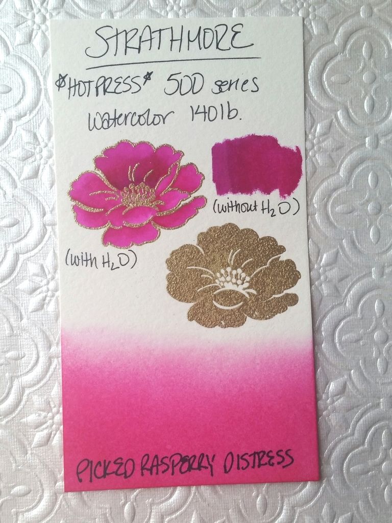
Today's post is one that I've been wanting to do for a while. A few weeks ago, I purchased two different kinds of hot-press watercolor paper after determining that my usual Strathmore cold-press 300 series had too much texture to do heat embossing with large-scale solid images, even with the help of my MISTI. I purchased two different brands: Fabriano Studio Watercolor hot-press 140 lb and Strathmore hot-press 500 series 140 lb. This afternoon, I was able to do a comparison of the two hot-press with my preferred Strathmore cold-press. I tested four different areas: (1)heat embossing, (2)ink blending, (3)watercoloring, and (4)Zig Clean Color blending without water. In order to maintain uniformity between the three papers, I used the same supplies on each sample for all of the tests. Here are my results:


1.) Heat Embossing: For this test, I used Ranger's Princess Gold embossing powder, Versamark ink, and an ek success anti-static tool. (I know the photo above isn't the best photo from a technical standpoint, but I thought it illustrated the texture or lack thereof on each of the solid embossed images) As I had previously discovered, heat embossing a solid image on the Strathmore cold-press was not an ideal method. The paper simply has too much texture, and this texture shows through the embossed image. The hot press paper is so much smoother in general, but between the two, the Fabriano seemed to give the best, smoothest, most even results. The embossing powder seemed to sink into the Strathmore hot press paper, while with the Fabriano, it seemed to lay nicely on top of the card stock and create a nice smooth finish. 


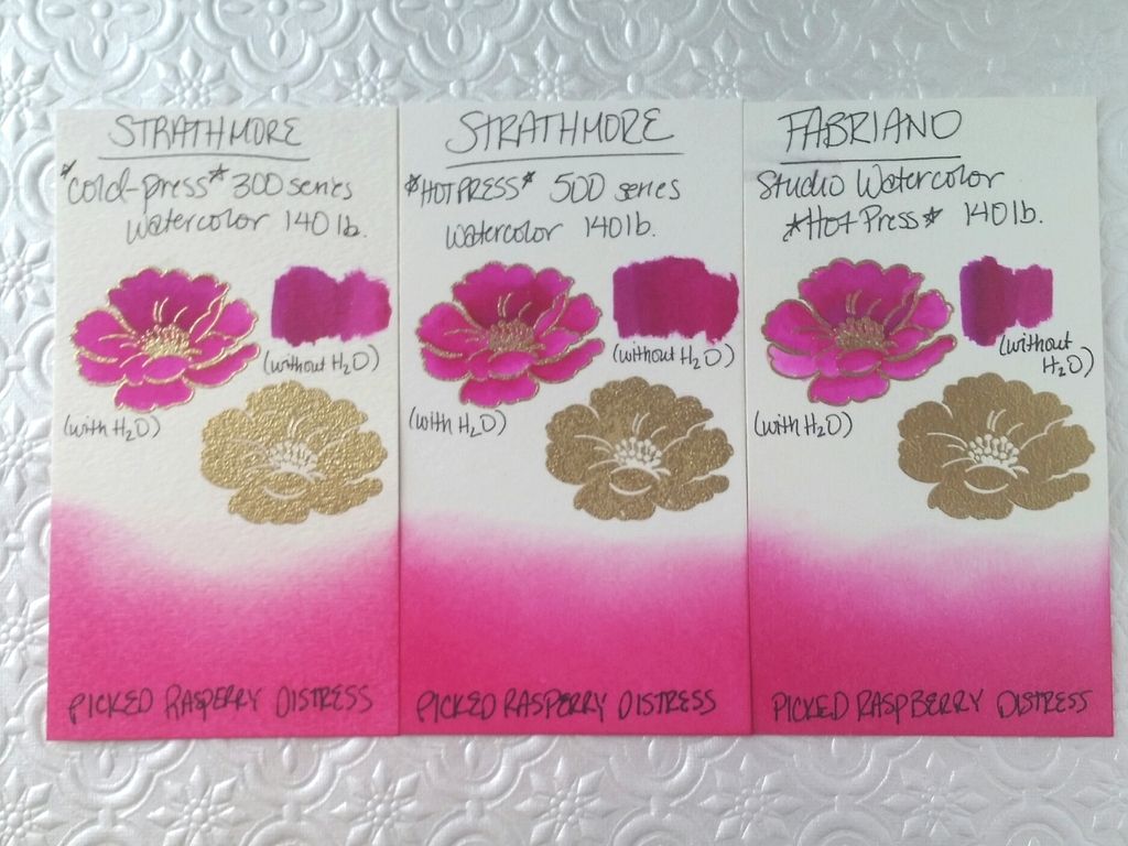
2.) Ink Blending: For this test, I utilized my Distress Ink mini blender and Picked Raspberry Distress Ink pad. I blended the same amount of time on each, even going back after letting each of the pieces dry for a minute. I found that the Fabriano guaranteed the best saturation, followed closely by the Strathmore hot press. The Strathmore cold-press seemed to allow the ink to lay on top of the paper for quite a while without really sinking in to give that deep, saturated color like the other two papers. 

3.) Watercoloring: For this test, I used two Zig Clean Color markers and a regular watercolor paintbrush dipped in water for blending out. You can click on the photos for a closer look at the blending. I found that the color seemed to sink into the Fabriano paper very quickly, instead of sitting on top of the paper and allowing one to move it with a waterbrush or wet paintbrush. If you follow me on Instagram, you will have seen this photo a few weeks ago when I was frustrated by how little the color moved on that paper:


I had similar results today, but the original ink lines were not nearly as obvious. The ink-blending results I found with the Fabriano make sense in conjunction with the knowledge that the color doesn't move as well after sinking into the paper. In my attempts to try to get the color to blend, the paper began to pill and warp.The Strathmore hot-press paper (on the right) had beautiful results with the Zig Clean Color markers. I've always had good results with the Strathmore cold-press, so I wasn't surprised to have good results with the hot-press, as well. I found with all three papers that if I moved quickly between when I laid down the color to when I attempted to move it with my wet paintbrush, it moved much more evenly without leaving a line where the original color had been laid down.


4.) Zig Clean Color Blending (without water): To the right of the outlined flower, I did some blending with just the Zig markers without the addition of water. I laid down the purple, then immediately followed with the pink, blending the color out until it was the original pink again. The Fabriano paper left the most obvious line of where the original color had been laid down. The Strathmore hot-press seemed to take longer (or more space) to actually fade back into the original pink from the purple. As I look at them now, after they've dried completely, the Strathmore hot-press has the smoothest and most subtle blend, even if it didn't fade entirely back to the original pink. 

Overall thoughts: I think that, of the three, the Strathmore hot-press seemed to perform the best, overall in 2 out of 4 categories (the Zig blending, both with and without water). The Fabriano did the best in the remaining two categories: the Distress Ink blending and the heat embossing. If I had to recommend purchasing one, I'd probably get the Strathmore hot press, just because it performed the best, or very close to the best, in all four categories. The only category that I wasn't totally thrilled with was the heat embossing, and that's really because I am kind of nit-picky. (To be quite honest, I think most normal people would be satisfied with the results for all of them, but I'm a crazy person haha!!!) I'm happy to know that my purchase of the Fabriano paper wasn't a complete waste of money, since I will be able to use it for distress ink blending with pleasure. The Strathmore cold-press does an excellent job with actual watercoloring. All three will be useful, but it will just depend on what technique with which I'm intending to use them. 

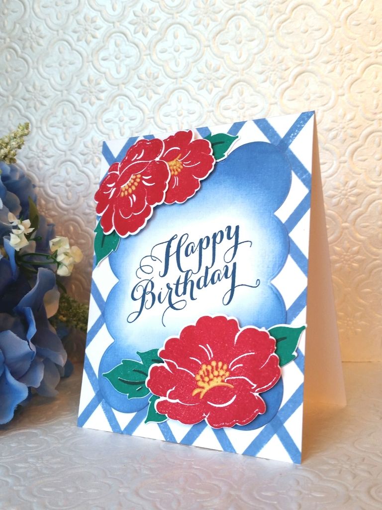
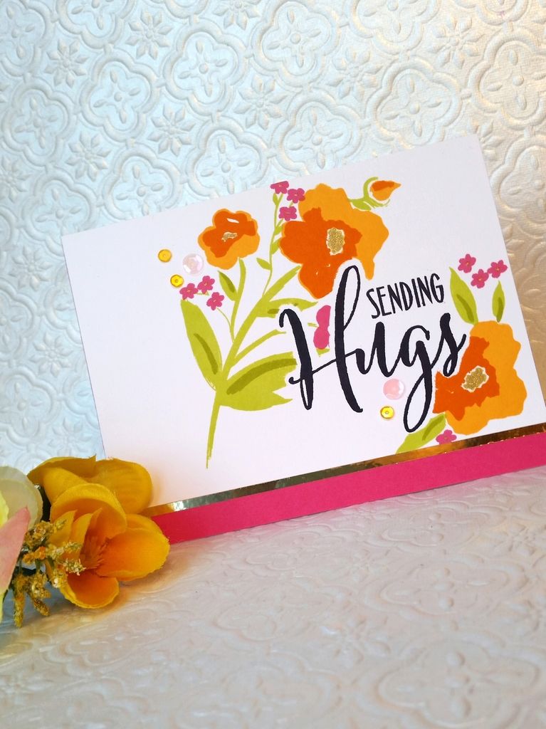
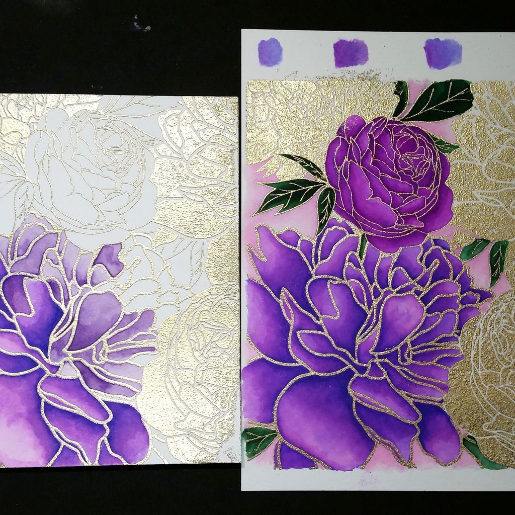
If you're still with me after all of that, thank you for visiting! If you have any good results with your own experimentation and would like to share them, please feel free to leave me a comment!! I will see you back here soon with a card that I made from the purple peony panel that I peeked in the hot-press watercolor photo! 

Friday, August 14, 2015

Vintage Linen love

Today's post is inspired by a dress that my 21 month old daughter was wearing last week. It's the cutest little dress, with a little ruffle on the bottom and the colors look so gorgeous with her fair skin and light brown hair and pretty blue eyes. Of course, I'm slightly biased, but I think she's the most adorable girl ever.) The colors and florals really inspired me, and I realized that I hadn't used my new Vintage Linens set from PTI. I pulled out some Zig Clean Color markers, my archival ink, and my Misti, and got to work.

I wanted to create a wreath of sorts, so I stamped one of each size of outlined flower on Post It paper to create some masks. (I bought it ages ago to use with my Cricut, but it didn't cut worth a darn, so I am glad that I finally found a good use for it!) I stamped and masked flowers on my Strathmore watercolor paper, then used my markers to color them. (Isn't that peachy pink just the most beautiful color??) I decided to turn it into a shaker card, so I die cut a circle out of the center. Then, I die cut a few of the larger flowers, colored them the same fuschia color, and placed them on the wreath so they overlapped with the shaker portion. I used my Fuse tool to create a shaker pocket, using seed beads and sequins from Hobby Lobby, Pretty Pink Posh, and The Ton. A die cut "thanks" from PTI's Wet Paint series cut in Royal Velvet over the top of the shaker and a lilac glitter strip at the bottom of the card finished it off.

Hope you all enjoyed! I've been working on some baby shower decor this week for my little nephew, so my card desk has been feeling sorely neglected. Hopefully I can get the bulk of the shower prep done this weekend so I can get back to my cards! Have a great weekend, friends!

Thursday, August 6, 2015

Officially obsessed.

The title says it all. This peony stamp is seriously so gorgeous.

My first card with this cling stamp from The Ton was trimmed down quite a bit, because I couldn't get the solid peonies to stamp well on the watercolor paper due to the texture on the paper. (It's Strathmore 140 lb cold press watercolor paper.) I have some hot press paper on order from Amazon, but until that arrives tomorrow, I decided to play around with some fussy cutting to attempt to get smoother solid peonies. I gold heat embossed the majority of the stamp on some of the same watercolor card stock. I watercolored the lined portion of the image with my Zig pens and fussy cut it out. In order to avoid the mottled, uneven appearance heat embossing on such textured cardstock takes, I embossed the image again in the same princess gold embossing powder on (smooth) pale pink cardstock. I glued the fussy cut piece on top of the pink panel and added a sentiment from PTI's County Fair. Some Fairy Pink sequins from The Ton finished it off.

I'm not sure if this paper pieced card achieved the goal I had in mind, but I think I like it anyway! We will have to see how the hot press paper does.  I hope you enjoyed it!

Tuesday, August 4, 2015

My peony obsession

So, I know that cling stamps are probably not that intimidating to anybody else, but I seriously was so worried, even AM, (AM=After Misti) about not being able to get a good impression that I was actually afraid to order any for fear of wasting my crafty money.

Boy, was I wrong. What was I waiting for?!

I saw the new Peony Background stamp from The Ton and immediately told myself "wow, that's gorgeous! I MUST HAVE IT." And then in almost the same breath said "Oh, wait it's cling. Too bad." Then I had a few people tell me that, with the misti, cling background stamps were super easy, simply because of the ability to re-stamp if you didn't get good coverage the first time. (Yes, this is the point where you may say "Duh, Emily!" Do people still say Duh?? Hmm...)

So I bought the beautiful peonies, and my only regret is that I didn't buy it sooner. I just wanted to play the other night, so I heat embossed the entire background on some watercolor card stock with gold embossing powder, then used my Zig Clean Color pens to color the flowers in my favorite shades of shocking pink and purple. I don't know that there are peonies in this shade of purple in reality, but boy, they are sure gorgeous. Someone should get on that if there aren't any.

My only complaint is that the solid peonies don't heat emboss well on my watercolor card stock, which is why most of them have been trimmed off. I think I might have a solution to this problem, but I'm going to have to experiment a little. It might not look as nice in reality as it does in my mind's eye.

The floral panel was trimmed down and backed with a turquoise shimmer mat to complement the touches of turquoise watercolor. I popped up the panel with some fun foam to give some dimension and added it to a Royal Velvet card base from PTI. I didn't want to detract from or cover up the beautiful flowers, so a gold foil sentiment from Winnie and Walter and some PPP sparkling clear sequins finished it off.

I hope you enjoyed! This is for sure not the last time these peonies will make an appearance here, so stay tuned. :) have a fabulous day, friends!