Monday, January 25, 2016

More Peonies? Seriously?

Yes, more peonies. Sorry, not sorry, but they're quite the addiction for me.

I've been trying to challenge myself to utilize my beloved, yet under-utilized supplies that I've been (ahem) collecting over the last year or two. One of the products about which I was most excited, but haven't really done a whole lot with, was the Peony cover plate from Papertrey Ink. PTI was my first stamping love, and their products regularly come home to live with me, sometimes lying in wait for the perfect project. The Lasting Hearts Card Drive was one such project, which you can read about in more detail HERE


For today's post, I created a trio of cards using the same basic concept and card design, but (slightly) switching up the techniques and colors used on each card. To start, I die cut three of the peony cover plates from the Canson watercolor paper that I discussed in my last post. I've been in an ink blending mood the last few weeks... I just love the soft results that you get with the technique. 


For all of the cards, I used the same basic "shading" idea that I used for my Sunflower card: choose two shades of the same color (all from the Distress Ink line), cover the entirety of the flower with the lighter shade, then add some of the darker shade towards the center of the flower to indicate shadows and depth. For this orange card (which I think might be my favorite of the three), I chose Scattered Straw and Wild Honey Distress Inks for this lovely peony image. I did remember this time to tape down the edges of the cover plate die cut with washi tape so that my edges would be nice and crisp. The leaves were done with Crushed Olive. Now, this next step might be extremely subtle, but I think it packs quite a punch: blending on the card base. I've been using this technique quite a lot lately, and I seriously just adore this orange card base. I started with a Summer Sunrise (from PTI) card base, then blended Spiced Marmalade from the edge toward the center, following with Ripe Persimmon just towards the edge. It creates a beautiful halo effect, leaving the center the lightest shade, which also helps to emphasize the shading on the die cut. 


This next card has such a soft, pretty look to it, quite different from the bold oranges and yellows of the previous card. I started with my pinks: Worn Lipstick and Picked Raspberry. The leaves were done with Cracked Pistachio, which I think is just the perfect shade of mint, especially when paired with pink. (swoon!) After I finished the blending and lifted the die cut, the resulting blending of the negative space on my scrap paper inspired me to make the blending on the card base a bit different: I used the peony die cut as a guide to mimic the blending found on the die cut, so as to create one continuous picture, instead of just allowing the outline to be the main attraction. I think this gives it a much more ethereal look. It almost reminds me of the chalk paintings in Mary Poppins. I added a bit of Tumbled Glass blending into the corners, as well. 


This last card is the simplest of the three. I used Shaded Lilac and Wilted Violet on the peony itself, Shabby Shutters for the leaves. I did a bit of blending around the edge of the card base using The Ton's Violet Fringe ink. After drying, the blending sort of faded into the card base, which is a shame. If I had been a little more patient, I would have waited to glue the die cut to the card base, but my children's naptime has been curtailed recently, so I was on a time crunch. 

The final element was to add the greeting to all three cards. I truly think that "sending hugs" is such an appropriate greeting for this particular cause, as you don't know who they will be going to, nor will you know their religious affiliations, etc. I die cut the "Hugs" from PTI's Big Hugs dies using Bazzill gold mirror card stock, then stamped and fussy cut the sentiment from the coordinating stamp set. All three cards were accented with Sequins mixes from Lucy Abrams

I am really pleased with how this card set came out, and I'm thinking I might have to make another set just to have on hand. I hope you're being inspired to participate in this worthy cause, and if not, I hope you're enjoying my offerings! Have a wonderful week, friends! 

Friday, January 22, 2016

Peonies have returned!!!

Happy Friday, friends!! (Am I the only one who is utterly thrilled that it's the weekend? This has been the longest week....) Anyway, I have a finished project for you today that I peeked on Instagram a few days ago. 

One of the things I vowed to be better about in the New Year was to create things I liked just because I liked them, not to put pressure on myself to create things because I think others would like them. I hadn't pulled out my Peony Garden background stamp from The Ton in awhile, so I thought I would pull it out and do some soft watercoloring for a card for the Lasting Hearts Card Drive.


 I started by heat embossing the background on hot press watercolor card stock using Hero Arts' White Satin embossing powder. Then came the uber fun part: the watercolor. I debated on whether to use my Zigs, but I wanted a more subtle wash of color, and I confess that I haven't yet mastered the beautifully subtle coloring that some others are able to achieve with the Zig markers. I decided instead to use Distress ink that had been diluted down. A bonus to using Distress ink is that I can easily add Perfect Pearls to the wash. I started by tapping Spun Sugar Distress Ink onto a clear acrylic block, then adding quite a bit of water to dilute the color, to which I added a few paintbrushes dipped in Perfect Pearl powder. I then used this color wash to add color to the entirety of the large flower, not taking much care to add shading, but making certain that every petal was colored a delicate pale pink. I then tapped some more Spun Sugar onto my block and added a few taps of Worn Lipstick, then added more Perfect Pearls and water to dilute. Because by this point the Spun Sugar wash had mostly dried on the large peony, I was able to add the darker shade of pink over the top without it mixing and sinking into the paper too badly, and get some really good depth on the petals. I did the same process with the smaller peony using only Picked Raspberry Distress Ink. I laid down the very pale color wash first, then went back later with a less-diluted and thus darker shade of the same color to add the shadows. It's difficult to tell in the photos, but the flowers have wonderful shimmer in real life.   


The leaves were colored with diluted Lucky Clover ink (LOVE that shade of green with these pretty pinks!), and the background was painted with diluted Broken China ink. To add the sentiment, I simply heat embossed one of the lovely sentiments from the Acts of Kindness stamp set by Hero Arts onto a strip of vellum. I had spent so much time on the background that I didn't want to cover it up, so I opted for this subtle addition. I added a few sequins in complementary colors, making certain to overlap the sequins on the edge of the vellum, to kind of help keep the vellum from curling up. 

I hope you enjoyed this project! I've got several more projects that I've completed for the Lasting Hearts Card Drive that I'll be blogging about over the next week or two. I'm so pleased to have such a good outlet for me to channel my creative energies, and I hope that you're inspired to create some projects for this worthy cause, as well.

Have a fantastic Friday and a wonderful weekend, my crafty friends!

Wednesday, January 20, 2016

Lasting Hearts Card Drive

Hello, friends!

You all know the uber amazing Jennifer McGuire, right? (I mean, you are living under a rock if you don't...) Anywho, she posted on her blog about the Lasting Hearts Card Drive maybe a week-ish ago. The cause is one that is very near and dear to my heart, having dealt with 2.5 years of infertility myself, while also having to watch my very dear friend deal with not one, but four miscarriages.... well, let's just say, this cause really struck a chord with me. It's in my friend's honor that I've been cranking out cards like crazy to send to the Lasting Hearts Card Drive.

Let's be honest. We all know that I'm not one who is often at a loss for words. But, when one of my closest friends told me that she was in the middle of a miscarriage, I can't say that I did a very good job of helping her through it... It was one of those situations that I just... didn't know what to do. I didn't know if I should say something, because I didn't want to remind and upset her if she had managed to forget about it for even just a second. I didn't know if I should just try to move on and get her mind off of it with mindless inanities. I didn't know if I should try to talk to her about it, if talking about it would make her feel better. I just... didn't know. What do you say to someone who has just lost a piece of her heart? So I didn't. It wasn't that I didn't want to, or that my heart was not aching for her. I told myself that I was giving her space to let her heal, that she would come to me when she was ready, but in truth, I was terrified of saying or doing the wrong things and making it worse. I wish I would have just told her that I was thinking of her, that I loved her, that I would do anything to help her. So that's what I'm trying to do with these cards. I've made several, some of which I'll blog about, some of which I will just post on Instagram. But I hope that they all remind these poor families that someone, somewhere is thinking of them and wishes they could do something to help with this burden that they are having to endure.

Today's project is fairly simple. (In fact, I made three of them.) The Sunflower Cover Plate from Papertrey Ink does not require much in the way of embellishment. To start, I die cut the sunflower image using Canson Watercolor paper (the kind in the big pad from Wal Mart). I haven't been pleased with this particular brand of card stock for use with my Zig markers, so I was extremely pleased with how well it blended using my Distress Inks and blending tool.


I blended the petals first with Scattered Straw, then added some Spiced Marmalade towards the center of the flower to indicate shading. The leaves were done with Crushed Olive and Forest Moss, again covering the entirety of the greenery with the lighter (Crushed Olive) and then adding some darker Forest Moss toward the center, where the leaves meet the stem. The center of the sunflower was Gathered Twigs, with some extra dark concentration of color towards the center. I did mask off the outer edge of the die cut with some washi tape when blending the center of the flower, and I wish I had done so for the entire thing. I managed to get some ink on the edge of the die cut, despite the care I was taking to prevent such a thing from happening. C'est la vie. 

The rest of the card is pretty simple, and in fact these cards came together quite quickly after I got all of the little holes pushed through the die cut. I used The Ton's Hot Tourmaline ink to blend the edges of the Jelly Bean (by Bazzill) card base. (The inks from The Ton seriously blend so beautifully, both on colored card stock and white, and I'm not just saying that because I'm on the design team.) The final step was to add the greeting: Big Hugs from Papertrey Ink. It has fantastic dies and sentiments to go along with it, and I simply don't use it enough. The Lasting Hearts Card Drive was the perfect reason to pull them out. I added some Glossy Accents to the Hugs to give it a bit more dimension and decided to stop. I felt odd not adding some sequins to it... maybe I will before I send them. Haven't decided.

I sincerely hope that you will participate in the Lasting Hearts Card Drive. You can also donate money to help purchase with which the handmade cards will be included. The link at the beginning of the post will give you all of the pertinent information.

I hope you enjoyed this project! I am so pleased to have finally used some of my PTI product that has been neglected for too long. Have a fantastic week, friends!

Saturday, January 16, 2016

A Deep Breath...

I'm taking a deep breath today. These past few weeks have been so busy, so today I'm going to share a card with you that I had intended to share a few months ago, but had quite forgotten about (yikes! Mom brain strikes again!) It's made entirely from a super super cute Mama Elephant set: Charmed. I received it a while ago (last summer maybe?) and immediately created this card with it, but promptly put it in my "finished" box and forgot about it!

This card's creation is fairly simple: a bit of stamping, a bit of masking, and some watercolor. To start, I stamped the lovely banner image with black Archival Ink, both on a panel of watercolor card stock and a piece of Post-It paper. I cut out the banner on Post It paper to use as a mask, then placed it over the banner on the watercolor paper. The rest of the stamping was normal. I stamped the wreath, then the owl, so that the parts that I wanted behind the banner would be hidden by the mask. I removed the mask and used my Zig Markers and Distress Inks to do some watercoloring. To create the kind of cloudy look around the wreath, I first wet my card stock, then added (very) diluted Pumice Stone Distress Ink that I'd tapped onto a clear block and diluted with lots of water. I simply dropped the color in on the wet card stock and allowed it to spread where it wanted. To age the panel, I swiped the edges with Papertrey Ink's Tea Dye Duo. I mounted the owl on a panel of sky blue glitz paper, then popped the whole panel up on a cotton candy pink card base. I added some Glossy Accents to the banner and berries, as well as a little twine bow to complete the project.


I have a whole set of these in various colors on my never-ending list of "projects to make." Hopefully, one day, I will find the time to make these. Sounds like a good project for when my mojo has taken a hiatus, as it is wont to do. A little watercoloring always does a body good, yes?

I hope you enjoyed this simple little project! I am not normally one for the cartoon-y animal stamps, but I couldn't resist this sweet little owl. I have plans to just kinda chill out in my craft room over the next couple of weeks... going to play with some stamps that haven't seen any love, do some organizing, play with my Foldio and try to get my blog photography up to snuff.

Friday, January 15, 2016

The Ton Anniversary Release- Blog Hop

Happy Friday, friends!!!


Today is The Ton's First Anniversary Blog Hop, to celebrate all of the utterly incredible products brought to you this week by The Ton. I hope you've loved every post and project from this last week from the crazy talented Design Team members (who I still find it amazing that I can count myself among them!) because I know that I have absolutely adored creating everything, and reading your wonderful comments on my projects was just the icing on the cake! Thank you all so much for your kind words. :) I've created five different (floral) projects for our blog hop today, so I hope you don't mind seeing some more flowers from me! Let's dive right in, shall we?

My first project is one with which I was particularly happy. I had several ideas roaming around in my head all week, with lots of pieces stamped and cut out just floating around on my desk. I had a vague notion of what I wanted to make with this card: flowers, gold glittery stripes, bold black die cut sentiment, but nothing concrete. Then it just suddenly clicked, and I am so pleased with how it came out. To start, I used the Haute Stripes rubber background stamp to create a gold striped background using gold glitter embossing powder. I knew I wanted a variety of sizes and types of blooms, so I stamped several of the peonies from Fresh Cut Peonies using the Coral Couture Color Collection, as well as several roses from Fresh Cut Roses using the Ruby Couture Color Collection. I fussy cut all of the blooms and leaves, then die cut the "fabulous" from black card stock. I arranged all of the blooms in a swag above and below the sentiment, using dimensional adhesive to pop up the center bloom, and added a few sequins.  


 My next project uses the same mint and lavender color combination from my post on day one of the countdown. The lovely roses were stamped with the Orchid Couture Color Collection, while the leaves were stamped with the Minted Couture Color Collection (CCC from now on! My fingers hurt lol.) The beautifully detailed vase was stamped with our Rose Gold Bangle pigment ink (isn't that vase just divine?!). The simple white card base was stamped with the Haute Stripes background stamp using Soft Orchid ink. The sentiment, from Friend Defined, was stamped in Smoky Quartz ink on the card base, then also on a white strip of card stock, which I later flagged at the end. Some sparkly sequins in shades of purple finished off this monochrome project. 


My next project uses the Morning Glory background stamp. I merely stamped the entire image onto a piece of watercolor paper using Plum Archival Ink, then chose a few blooms to watercolor with my Zig markers. I fussy cut them,  then stamped and heat embossed the greeting from Fresh Cut Roses onto a scalloped black rectangle die cut.  I popped up the black scalloped rectangle onto a pale pink card base, then arranged my florals so that they would overhang and go all the way to the edge of the card base. The final step was to add a few complementary sequins to add some sparkle


My next project uses a technique that I absolutely love, but don't often remember to do, because I don't use Kraft cardstock very often.... I'm not a huge fan of brown, if you can believe that. To start, I stamped all of the bottom layers of the roses from Fresh Cut Roses using Hampton White pigment ink in a totally random pattern, which I zapped with my heat gun to nudge the drying process along. I then used the Ruby CCC to stamp all of the layers of the roses. I created one mask for each rose shape, covered my roses, and used the Hot Tourmaline ink to stamp just the bottom layer of the leaves. (It's amazing how much lighter, but still vibrant, the ink shades are when stamped over the top of the white pigment ink.) I had a light pink oval on my desk from my pink and gold wedding gown project from Day 4, and I used that to stamp my sentiment in Noir ink. The oval die cut was looking a little bare, so I quickly stamped and fussy cut another rose and some leaves. I thought some twine would be appropriate given the shabby chic feel of this project, over which I adhered my oval die cut with dimensional adhesive. Some sequins in various shades of pink added a little sparkle. 


Now, this project might be my favorite from the whole release. (To say that I'm obsessed with these roses is a bit of an understatement....) As soon as I saw the rose and stripes stamps, my mind was flashing images of products from Rifle Paper Co. Flowers and stripes go together like peanut butter and chocolate. I've got about a gajillion things pinned on my "inspiration" board on Pinterest. I started by double stamping the entirety of the Haute Stripes on a square of white card stock with Noir Couture Color ink. By using my MISTI and double stamping the stripes, they're so perfect that they look almost printed. My next step was to stamp the Fresh Cut Roses using the Ruby, Peony, and Citrine CCC's and fussy cut them. (That was not a quick process for all of those flowers and leaves, let me tell you. But it was worth it, I think.) I stamped my greeting from Friggin Fabulous onto a white 6x6 card base. I had originally planned in arranging my flowers in a simple circular wreath shape, but I decided that, with all of the Valentine inspiration flooding my Instagram feed, I wanted to do a heart. I die cut a fairly large heart out of the center of my square striped panel, then popped up the stripe panel. I arranged my flowers the way I wanted them, adhered them, and finally added some sequins. 


If you're still with me at the end of this ridiculously long post, thank you! I hope you've enjoyed these projects! The products released this week are so incredible, so you've certainly not seen the last of them on my blog!!  

Have fun hopping around to all of the talented designers we have joining us for this special blog hop! Don't forget to comment on each blog to be entered to win one of FOUR $10 gift certificates to The Ton's shop, as well as a grand prize of a $25 gift certficate to the shop! The winners will be chosen randomly from amongst all of the bloggers on the hop. The deadline to leave a comment is Wednesday, January 20, 2016 at 11:59 pm EST. The more comments you leave, the more chances you have to win. Here's your list of participants:

The Ton
Emily (you are here)

Happy Hopping!!! 

Thursday, January 14, 2016

The Ton Anniversary Release- Day 4


Hello, friends! Welcome back to the final day of The Ton's Anniversary Release! We hope you have enjoyed all of the previews and inspiration.  Today, we are showcasing the final sets in our Anniversary Release lineup: Friend Defined, Love Defined, HauteWedding Dress, and Wild Morning Glories, which brings the total number of stamp sets to SEVENTEEN, including four rubber background sets and thirteen clear stamp sets, as well as two amazing new dies. All of the products that have been previewed over the last four days are available right now on The Ton's website.

My first project for today focuses on two of the new sets from this week: Haute Wedding Dress and Fresh Cut Roses. This dress.... oh, this dress. When I first got the stamp sets, I may have squealed in excitement when I came to this set. This  image is the epitome of class. It's large enough to really be a focal point on a card. And there are so many fun ways to customize it.... you're going to just love this set, belieeeeeve me.

To start, I heat embossed the image on a sheet of my favorite watercolor paper using gold embossing powder. Then came my most favorite part: the coloring. I know, I know, wedding gowns are supposed to be white or cream, blah blah blah. My hubby and I got married right before Pinterest, do-it-yourself, "unique" weddings exploded into their current state of awesomeness. There are so many things that are popular now that I wanted to do then, but they weren't really "the way things were done," so I just had to put my ideas aside and be traditional. One of the things I would have done in a heartbeat was have a blush pink wedding gown. Alas, my wedding gown was a very lovely, but very ordinary white, and my hubby thinks vow renewals are a waste of money (only when he's the one spending it. They're fine and dandy for other people.), so I will have to have my pink gown on a card.

SO, back to the project, I colored my image with only three Zig markers, fussy cut it, and set it aside. I then stamped all of my roses from the Fresh Cut Roses set using the Ruby Couture Color Collection. The leaves were stamped with just the base layer using Delicata Gold ink. I fussy cut all of them out and turned my attention to the shaker. I mounted a panel of patterned paper in a lacy gold foil pattern on my card base. I then die cut an oval from an A2 sized panel of bubblegum pink card stock and filled my shaker with various sequins from The Ton, including Gold PosiesNugget Seed Beads, and Pink Heart Confetti. A couple of gold foil die cut flourishes were added to the floral cluster to frame the shaker window. I didn't add a sentiment, because I thought the card could potentially be used for several occasions, perhaps for a shower or asking a friend to be a wedding attendant. 


My next project uses only the Haute Wedding Dress stamps, with a sentiment from Timeless Icons Sentiments. It's nice and flat, perfect for mailing. I started with an A2 panel of watercolor card stock and heat embossed the dress, with the accompanying floral applique on the bodice and on the bottom edge. I then used the same floral applique stamps to add some dripping flowers to the top corners of the panel. I watercolored the image using my Zig markers. I heat embossed the sentiment from Timeless Icons Sentiments in the same white pearl embossing powder and began adding color to the background using Broken China Distress Ink, water, and a Paintbrush. I simply tapped the Broken China inkpad on a clear stamp block and diluted it with water, concentrating more color on the sentiment and in the corners with the flowers, so that the white pearl heat embossing would stand out. A few sequins "floating" gives the illusion of the woman being showered with flowers.  


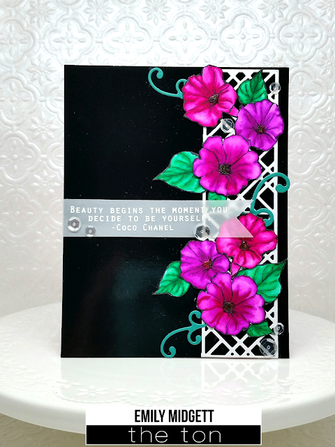
My final project for today focuses on the Wild Morning Glories set. I love that this set is so versatile... you get solid stamp images along with the outlines, so you have the option to stamp and get great depth, or stamp just the outlines and color them to create depth. (Guess which option I chose??) I stamped the outlines of the flowers and leaves on some watercolor paper, then colored them with my Zigs, concentrating the color in the centers and around the edges, then using my wet paintbrush to pull the color out, making sure that the lightest sections were in the broadest part of the petals, as (in my mind) that is where the light would be hitting the flower most strongly. I know the coloring isn't perfect, but it's satisfactory to my novice eyes. :) I adhered a section of the Lattice Cover Plate to the side of my glossy black background, then arranged the flowers and leaves to be "climbing" up the side, as real morning glories do. I added a few little flourish die cuts to add a bit more color and to mimic the tiny, curly sprigs that are on morning glory vines. The sentiment, a favorite from the Timeless Icons set, was heat embossed onto a strip of vellum, then the end was cut into a flag. I wrapped it around the glossy black card stock panel and adhered it, then added a couple of dots of adhesive in strategic spots, which I later covered up with some Glass Slipper Sequins. The finishing touch was some Glossy Accents in the center of each of the flowers. 


That's all for me today! Now, the details about the GIVEAWAY!!! We are giving away four $15 gift certificates to the shop. Just leave a comment on The Ton Blog to qualify and leave comments on the DT blogs to increase your chances of winning. DEADLINE TO LEAVE COMMENTS: SUNDAY, 1/17/16 


Enjoy all of the fantastic inspiration that the DT has in store for you! Happy Hopping! And don't forget to comment on each blog to increase your chances of winning! :)

Wednesday, January 13, 2016

The Ton Anniversary Release- Day 3

Happy Wednesday, friends!! Back again for Day 3 of The Ton's Anniversary Release countdown. I hope you've been enjoying all of the wonderful products being released!! I know we've all been enjoying sharing our projects with you. Only one more sleep until you will be able to purchase all of these utterly fabulous products.... such anticipation! 


If you're just joining us, The Ton is releasing 17 (yes, SEVENTEEN!) new stamp sets and 2 fantastic dies (an amazing coverplate and a new word die) in celebration of their one year anniversary! Today, we are focusing our attention on Tribal Chic Borders, Like a Boss, Geometric Lattice Cover Plate, Geometric Lattice background stamp, and Fresh Cut Orchids. I've already given a sneak peek of the Tribal Chic Borders here, and the Geometric Lattice background stamp here, so here are some projects featuring some of the other goodies being showcased today. 

My first project focuses on Like a Boss and the Geometric Lattice Cover Plate. The Like a Boss set is chock full of cheeky, crafty sentiments. Now, being a girly girl who loves all things sparkly, the "When in doubt..." sentiment really spoke to me. (I'm sure my husband would agree... all he has to do  to distract me is flash something sparkly in front of me, which works far too well when I'm irritated with him!!) The moment I saw that fantastic cover plate, I knew I wanted to die cut it from glitter paper. It's so beautifully intricate, but still so modern and graphic... just gorgeous. I simply die cut it from some silver DCWV Glitz paper and adhered it to a turquoise card base. My next step was a bit more involved... I die cut each of the flowers from the Petal Cut Peonies die set using regular card stock. I glued the (matte) flowers to a darker shade of the Glitz paper, then fussy cut around the edges. I just love the effect. For the sentiment, I simply heat embossed it on a rectangle of vellum. I adhered the flower first, then I was able to hide my adhesive behind the flowers and sequins. The photos do not do justice to the glitzy, glittery goodness. 


I was so inspired by my glittery lattice die cut that I wanted to use it again on my next card. The orchids in Fresh Cut Orchids are just incredible... The detail is so beautiful, and the ink colors available in the store are the perfect pairing. I die cut the Lattice Cover Plate from some orchid colored fine glitter paper, then adhered it to a navy blue card base. (I just love navy and orchid together... so classy!) I stamped the stem, leaves, and flowers on white card stock, then fussy cut them. The Orchid Couture Color Collection is a perfect match for the Fresh Cut Orchids. I heat embossed the sentiment (from Timeless Icons Sentiments) on a panel of vellum, then arranged my orchids on the panel, popping them up with dimensional adhesive, which I again used to hide the glue when adhering my vellum panel to the card base. A few sequins added some more sparkle to the card front. 


My final card for today is similar in layout to the previous card, but I wanted to showcase how beautifully the new inks blend, as well as how perfectly they work with these Fresh Cut Orchid stamps. I began with a panel of white card stock. Using my round ink blending tool, I covered the entire panel with Orchid Crush ink, then blended Violet Fringe ink around the edge to create a halo effect. I knew I wanted to stamp directly on the blended panel, as opposed to stamping the flowers and fussy cutting them, so after the blended panel was completely dry, I stamped bottom layer of each of the stems, leaves, and flowers using Hampton White pigment ink. I stamped the flowers with 3 layers of the white pigment ink for the bottom layer, allowing a few minutes of drying time in between each stamp. This made the white image truly opaque. I allowed the white images to dry, then stamped the images again with the colored ink. By stamping with the white ink first, I was able to avoid a somewhat "muddy" color that could have occurred from mixing the green ink and the purple ink, as well as allowing the images to really stand out on the colored background. I added the sentiment, also from Fresh Cut Orchids, in Noir Dye ink. A few Glass Slipper sequins added a touch of sparkle to this otherwise completely flat card. 


I hope you've enjoyed the projects today! All of the new products shown today will be available for purchase tomorrow, November 14, at 7am EST.

Now, for the GIVEAWAY details! We are giving away four $15 gift certificates to the shop. Just leave a comment on The Ton Blog to qualify and leave comments on the DT blogs to increase your chances of winning. DEADLINE TO LEAVE COMMENTS: SUNDAY, 1/17/16 


Let us know what is your favorite set released today, and then head over to the other design team members' blogs... Each DT member has some seriously amazing inspiration for you. Remember to comment on each blog to increase your chances of winning!! Happy Hopping!

Tuesday, January 12, 2016

The Ton Anniversary Release- Day 2

Welcome back to Day 2 of The Ton's First Anniversary Release! 


For our Anniversary Release, we have 17 new stamps (clear sets and cling background stamps) and 2 new dies (one fabulous coverplate die and a word die). For Day 2's post, The Ton is featuring four new clear stamp sets and two new rubber background sets: Honey Bears, Love and a Dog, Love and a Cat, Purrincess, (all of which were designed by our very own Mayline!!!) Haute Stripes, and Stripe Addict. Mayline created three videos to show you how easy it is to customize your critters. You can check them out HERE, HERE, and HERE

This first card set features the new set Honey Bears! The set features several bears standing and sitting in different poses, with different accessories, and different facial expressions. The possible combinations are endless. How adorable are they!?! I created a set of three cards, using the bears and a new background set being debuted later on this week. To start, I stamped three of the bears onto some watercolor card stock using some black Archival ink so that I could use my watercolors. I then stamped some of the accessories, including the darling scarf and hat, birthday hat and bowtie, and some balloons. I colored them all with my Zig markers, then fussy cut them and laid them aside. 


For the card bases, I stamped a background using a new background set: Tribal Chic Borders. I wanted to keep to a pastel color scheme, so I used Lofty Mint, Blue Diamond, Peach Blossom, and Rose Quartz inks.  I stamped the darling "I love you beary much" from the Honey Bears set using Smoky Quartz ink, then popped up the bears with dimensional adhesive. I accented with a few sequins, including Glass Slipper, Peach Mousse, and My Tutu. Super clean and simple, but those darling bears don't need much.

My next card was so difficult to create, ONLY because there are so many friggin' adorable images in Love and a Cat that I had a hard time deciding which one to use! My card does not do this adorable set justice... So many fabulous, clever possibilities with all of the little kitties and accessories in the set, but alas, I was running out of time. (As usual....) I promise, you've not seen the last of these little mowsers on my blog.

I started with a panel of plain white watercolor card stock. I stamped the little snoozing kitty image (I loved this one, particularly, because my kitties like to sleep like this, too!) using black Archival ink in the corner of my panel, then watercolored him with my Zig markers. I wanted to have kitty dreaming of being naughty, because I wanted to use that fantastic sentiment, so I die cut a "dream bubble" with which to create a shaker. I very lightly traced the circle on the card base, so I would have an idea of where the circle would be on the finished product. I then heat embossed the sentiment in black, to achieve an emboss-resist look. I used all three shades from the Blues Couture Color Collection to do some ombre ink blending, to give the illusion that kitty was dreaming of a fish bowl. I stamped a few bubbles, then colored them in with my white Wink of Stella pen. To fill the shaker portion, I stamped several whole fish and several half-eaten fish, colored them, and cut them out. I added several shades of blue sequins and some Ultramarine seed beads to the shaker.


These cards showcase just a few of the adorable little critters you will find in this release! Aren't they just darling, and so, so clever?! All of the products showcased here today will be available for purchase on The Ton's website on Thursday, January 14 at 7 am EST. I hope that you have enjoyed my offerings, and be sure to hop around to the other DT members' blogs, because their projects are fabulous.

 We are giving away four $15 gift certificates to the shop. Just leave a comment on The Ton Blog to qualify and leave comments on the DT blogs to increase your chances of winning. DEADLINE TO LEAVE COMMENTS: SUNDAY, 1/17/16

Vera's Blog

Happy Hopping! Remember, be sure to comment on each blog to increase your chances of winning!! :)


Monday, January 11, 2016

The Ton Anniversary Release- Day 1

Helloooooo! Boy, is this an exciting week, becaaaaauuussseee........


Welcome to The Ton's First Anniversary bash! I can't believe it's only been a year since The Ton came on my radar, but I am simultaneously marveling at the fact that they've already been here for a whole year. So many great releases, so many great products.... and this release is certainly no exception. For our Anniversary Release, we have 17 new stamps (clear sets and cling background stamps) and 2 new dies (one fabulous coverplate die and a word die). For Day 1, The Ton is featuring three new stamp sets and a new word die: Fresh Cut Roses, Timeless Icons Sentiments, Morning Glory Garden background, and the new Fab word die! These are going to become staples in my craft room, for sure.

Let's start with Fresh Cut Roses. This set is SO crazy gorgeous. They are just the perfect size... not too big, not too small, and they work perfectly with our new inks. For this card, I used the Orchid and Minted Couture Color Collections. I stamped several of the roses and leaves and fussy cut them, then set them aside. I stamped a plain white card base with a new background stamp that you'll see later on this week using Lofty Mint Couture Color. The sentiment is from another new set: Timeless Icons Sentiments. This sentiment set is so very versatile, with so many wonderful quotes from Audrey Hepburn and Coco Chanel. I stamped the Audrey Hepburn quote onto a strip of white cardstock, then flagged it at the end. I arranged the roses and leaves in a cluster on a lavender die cut doily, then placed the sentiment flag amongst the flowers. The final touch was some complementary sequins from our line of Gilding. 


My next card showcases the roses arranged in the absolutely stunning urn included in the Fresh Cut Roses set. I heat embossed it using copper embossing powder. (Just take a gander at all of that detail! So stunning.) I used the Minted inks to stamp the leaves, while the roses were stamped using the Coral Collection. When I think of roses, I don't immediately think of orange, but aren't they just SO stunning? I love, love, love having these trios of inks that complement each other so perfectly. I fussy cut the flowers, leaves, and urn and set them aside. I used the super popular Rose Gold Bangle ink to stamp the A2 card base with a new background stamp that will debut later on this week. I stamped the sentiment from Timeless Icons with Noir dye ink onto a strip of white card stock. I took a panel of emerald card stock and did some blending around the edges with Hot Tourmaline ink.  I arranged my flowers and urn on the card base, then popped up the emerald frame with some dimensional adhesive. The sentiment flag was adhered to the frame, then the card was accented with some Smoked Emerald and Peach Mousse sequins


My final project for today showcases the gorgeous new Morning Glory background stamp. I'm sure you all are very well aware of my love affair with The Ton's incredible flower stamps with my Zig markers.... this stamp just fueled my obsession. I stamped and embossed it with white embossing powder onto some hot press watercolor paper. I then used some shades of deep fuchsia and deep purple to add color to the flowers. I set the panel aside to dry and set to creating my sentiment panel. I cut a strip of vellum, then heat embossed the beautiful sentiment from Fresh Cut Roses in the same white embossing powder. I flagged the end, then came to the ever-present dilemma when using vellum... how to attach it without having an unsightly lump of adhesive. I decided to fussy cut one of the partial flowers from my watercolored panel and hide my adhesive behind it. 


I created my shaker and filled it with various sequins and beads, including some Crystal Flora sequins and Diamond seed beads. I attached the vellum flag with a strip of adhesive on the very edge, then covered it with the partial watercolored morning glory. I adhered my shaker to an emerald card front. 


I hope you've enjoyed the projects today! Now, for the GIVEAWAY details! We are giving away four $15 gift certificates to the shop. Just leave a comment on The Ton Blog to qualify and leave comments on the DT blogs to increase your chances of winning. DEADLINE TO LEAVE COMMENTS: SUNDAY, 1/17/16 


Let us know what is your favorite set released today, and then head over to the other design team members' blogs... Each DT member has some seriously amazing inspiration for you. Remember to comment on each blog to increase your chances of winning!! Happy Hopping!