Tuesday, October 27, 2015

Adventures in Heat Embossing....

Hello, friends!

Today, I have a couple of cards to share with you. I wasn't originally planning on sharing one of them, as I decided that it wasn't "perfect," and so therefore could not besmirch my blog with its untidiness. And then I told myself to get over it, that I was not the Dowager Countess of Grantham, and nobody would care if my card was a tiny bit untidy. Plus, the kind people on instagram made me feel like I was being overdramatic about my stray embossing powder specks. (haha!)

(I must apologize in advance for these incredibly poor photos; today was particularly gloomy and dreary, and even my Ottlite daylight lamp did not help very much.)

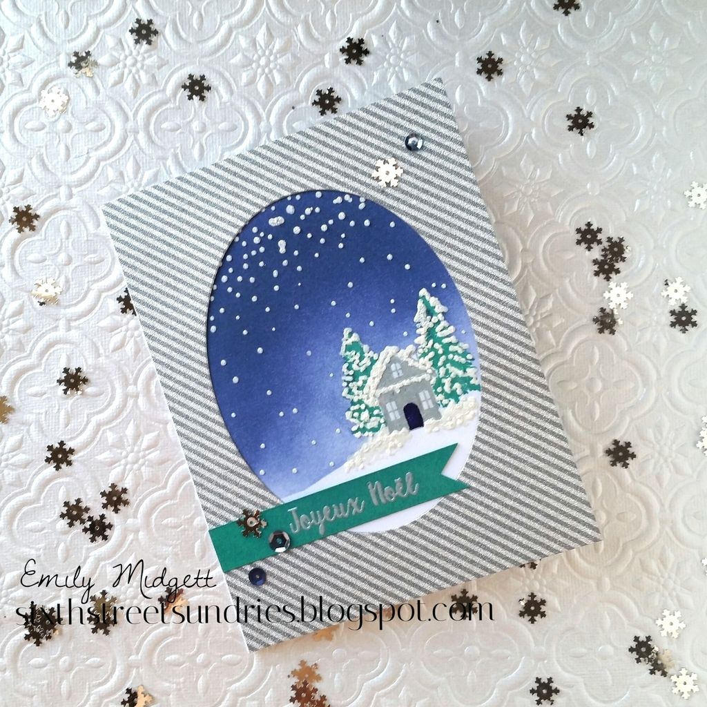
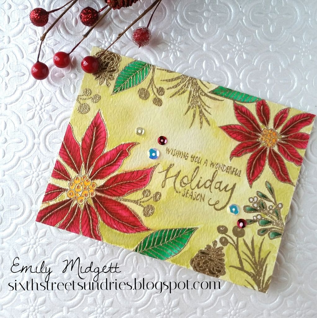
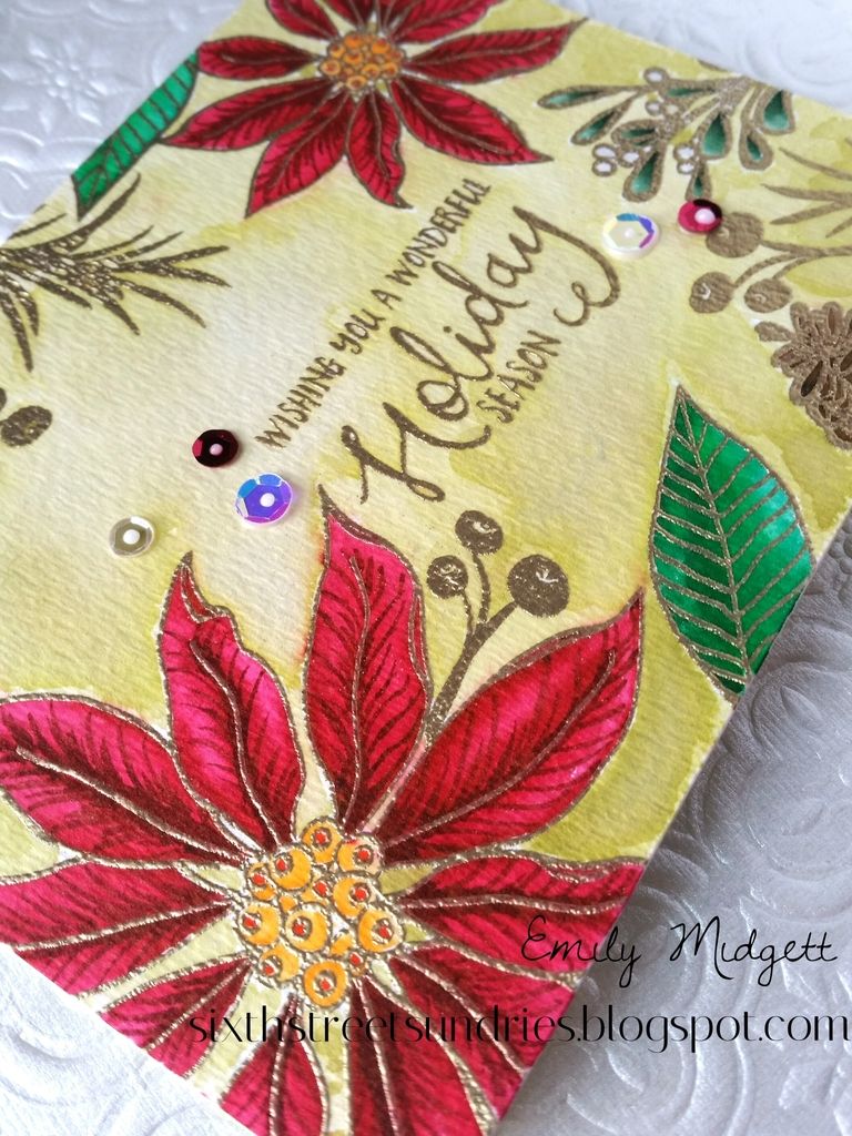
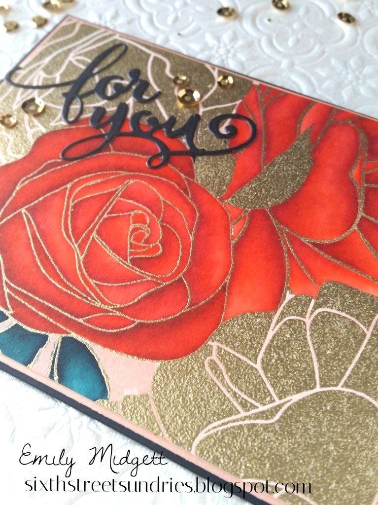
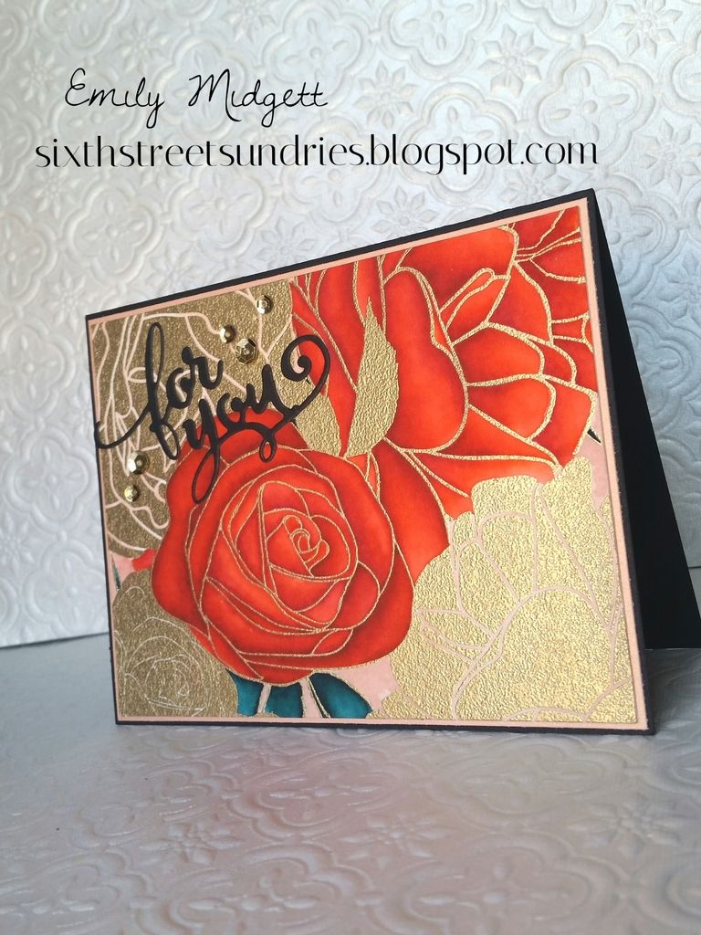
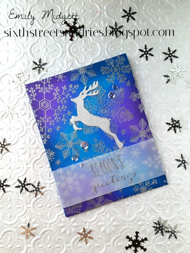
When I received the Avery Elle Christmas Florals set from Butterfly Reflections Ink, one of the first ideas that popped into my head was to make one of those cards that is so deliciously simple in concept that it is almost always more complicated in execution than it is in theory. I wanted to heat emboss the florals on black card stock with a striking gold sentiment. Well, I had just discovered the day before the wonder that is double heat embossing, and so decided that my Christmas Florals had to be as bright and bold as possible, so I needed to double heat emboss every.single.image. Yeah, I'm here to tell you: if you put that much embossing powder on black card stock, even if you use an anti-static tool, you will get stray pieces of embossing powder that in your excitement over the wonders of double heat embossing you will not notice until the entire card is finished. Or maybe that's just me.


Also, a tip from me to you: stamp your wreath FIRST, then do your sentiment. There may or may not be a misplaced sentiment beneath the scalloped oval die cut. If you receive this card in the mail, pay no attention to the glimmer of gold behind the die cut. You've been warned.

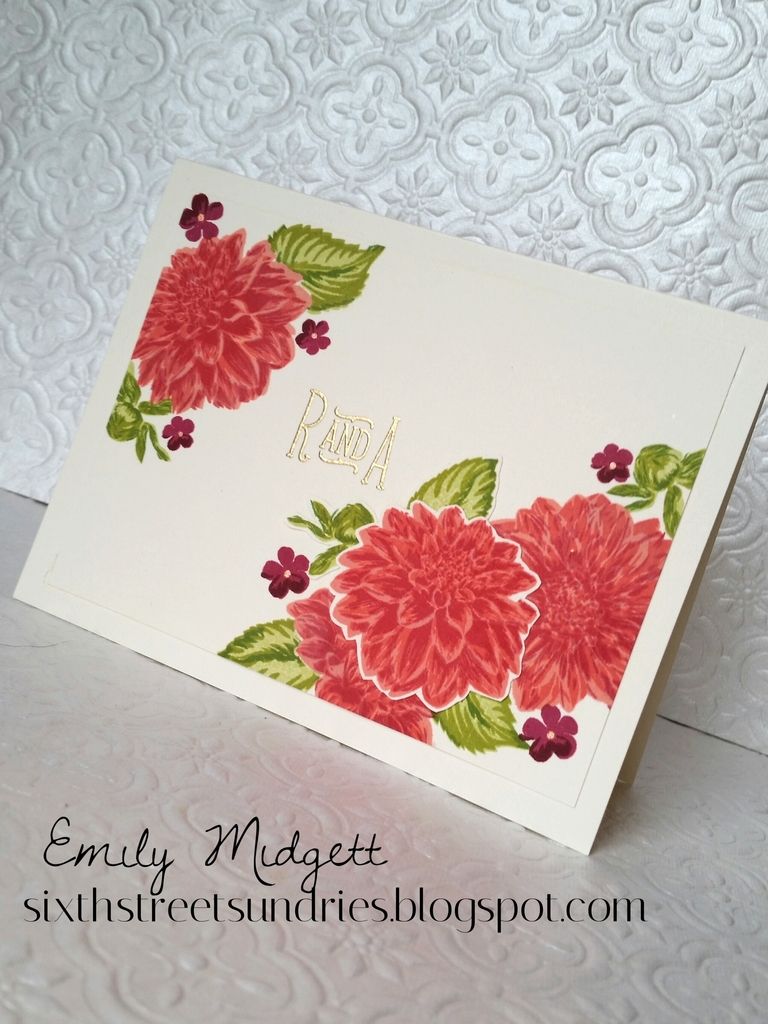
After attempting to photograph my extremely imperfect card and realizing that enhancing the lighting in the photo would bring forward every single piece of stray embossing powder that had landed on the panel, I decided to do a simpler version, using simple stamping instead of heat embossing. The construction is simple using a MISTI: simply stamp you image, rotate your panel 180*, then stamp again. Everything comes out nearly perfectly symmetrical. I used various Hero Arts inks for my simple stamped card, including Emerald Green and the darkest and lightest strips of the Red Ombre ink pad, both from Hero Arts. (Those ombre ink pads really give you a lot of bang for your buck, because you can use the individual colors on smaller stamps!)


After looking at the gorgeous shine on the black card, I decided to add some Clear Pico Embellisher to the flowers and berries on my simple stamped card. I think it adds just the right amount of shine to an otherwise plain card. Both panels were popped up with fun foam on their respectively colored card bases. 


I hope you enjoyed this little foray into my obsessive perfectionist brain! My house may be a mess, but if I make a mistake on a card.... no no no no no! Anyway, see you again soon. Have a fabulous week, friends!

Monday, October 26, 2015

Have a Magical Christmas

Hi all! I'm up on the Butterfly Reflections Ink blog today with a set of vintage inspired holiday cards. I hope you'll stop by to check them out!

Have a fabulous week, friends!

Saturday, October 24, 2015

Have a cup of cheer...

Happy Saturday, everyone! I hope your weekend is moving along splendidly. 

I have a trio of somewhat non-traditional holiday cards for you today. Now, if you follow me on Instagram, you'll know that I have been having a love/hate affair with these images all week long. I just couldn't get them to do what I wanted them to do. I ended up having to redo them THREE TIMES just to get it right. I have the process down now, so I hope you're interested in my final product. I had an idea in my head, and I am stubborn enough that I wouldn't stop until I had it figured out. Three times. Haha! Top two things I learned: don't use Fineliner masking fluid on Copics, and don't saturate the card stock too much when using Copic markers. 


I began with the super cute-but-still-sophisticated holiday drink images from Holiday Cheers by Your Next Stamp. I stamped them all with Memento Black Tuxedo ink, then colored them in with Copic markers. Now, I don't know if part of my problem is that I've been using my Zig markers so much that I kinda forgot how to use my Copics... whatever the reason, I apparently needed more practice with my Copics. Anyway, I wanted to create that sort of halo effect that Jennifer McGuire did in one of her recent videos. In order to achieve this, I used my Clear Pico Embellisher over the top of the images, then set them aside to dry.  


While the stamped images were drying, I created the card bases. There is something so beautifully subtle about tone-on-tone backgrounds... I just love them. They make quite a visual impact without being overpowering, you know? I stamped the three card bases in complementary shades of dye ink using the Hero Arts Hand Drawn Snowflake background rubber stamp. (Have I mentioned how silly I feel for being so terrified of rubber stamps? Think of how much time I've wasted being terrified of something so easy to work with...) When I was finished with the backgrounds, I went back to my focal panels, which were close to being dry. I double heat embossed the "Cheers" greeting (from the Hero Arts Holiday Greetings stamp set) using silver embossing powder. Now, some people might be able to do this free hand, but I couldn't have done it without the help of my trusty MISTI. That thing is worth its weight in gold, people. Double heat embossing alone makes it totally worth the investment, to me at least. Look at how smooth it looks... almost like molten silver. Love. 


Once I was certain that the Pico embellisher was dry, I did a bit of a resist technique to create that gorgeous haze around each drink using my Distress Inks and my round blending tool. I love the halo effect it creates. (That Jennifer McGuire... she's something else. A crafty rock star, to be sure. Also a genius.) I mounted each white panel to a piece of glittery card stock cut slightly larger, then mounted all of those to their coordinating card base. Now, on one of my cards, I did have a few ink mishaps in my excitement over finally getting my idea to come out right, so I simply covered the splotchy areas with some sequins from Lucy Abrams. Not in my original plan, but I like it nonetheless. Kinda remind me of champagne bubbles, and champagne reminds me of New Year's Eve, and NYE reminds me of the holidays, so naturally it all fits. (ha! convoluted reason, no? That's my brain for you.) 

I hope you enjoyed these festive little cards! My kiddos' birthday party is one (gasp!) ONE WEEK, and I've been so busy coloring Christmas cards that I've not gotten done NEARLY enough decorations. Be on the lookout for a post or two with some pictures from our hoedown. Have a great rest of your weekend, friends! 

Friday, October 23, 2015

Some Exciting News...

So, I've been a little quiet on the blog front this week, and I apologize for that. I have two main reasons for that: 1) It seems like all of the cards I've made the last week or so haven't really been "blog-worthy," though if you follow me on Instagram, you'll probably have seen some of them. The ideas I've had buzzing in my head have either taken forever to finish, or they just haven't come out quite right.  

And reason #2 is the reason I have check-to-see-if-I'm-dreaming pinch marks all over my arms (not really, but I did kinda beat my husband up out of excitement when I got the email): I was asked to be a member of The Ton's Design Team!!! 


YAY!!! 

If you've followed me for the last year, you've  noticed that I, like so many others, have a slight obsession with The Ton's stamps. Like, I had to restrain myself from using them on every.single.card. The super classy style of all of this company's products have been right up my alley. And the coloring options... oh my peas! Seriously, they're awesome. 

Anyhow, in order to show my gratitude to Effie for giving me this incredible opportunity, I created a card for the occasion (shocker, I know):


This A7 card is a monster compared to my normal A2 cards. I thought it was an excellent size to fully utilize all of those absolutely stunning Large Peony 1, 2, & 3 sets. (I've linked to each individual set, because there are three of them.) Each flower is so stunning that I had to have them all. Some people (ahem, my husband) might ask why I needed all three. Because, dear. Because. Just look at them all together!!! Gah!


Anyhow, I heat embossed them in gold on my favorite Strathmore watercolor card stock, then got to work coloring them with my handy-dandy Zig Clean Color markers, water, and paintbrush.


I hope you enjoyed this card! It is seriously such an honor to be amongst such talented ladies. I look so forward to creating even more projects using their stamps in the months to come! Have a fabulous day, friends, and I will see you back here tomorrow with yet another Christmas card! (or three! haha)

Thursday, October 15, 2015

It Came Upon A Midnight Clear...

This was one of my most favorite Christmas songs growing up. My mom had a Johnny Mathis Christmas tape (yes, tape) that we listened to over and over while putting up Christmas decor and making mountains of cookies. Marshmallow World was my absolute favorite, but this song followed close after. Something about the imagery just really spoke to me... a peaceful Christmas night... it still speaks to me. 

The peaceful night imagery really seemed to be impressed on my creative psyche, so here is my interpretation:


To start, I die cut the window of the full A2 panel (DCWV Twinkle Glints paper) using the Avery Elle Sweet Scallops dies, which I then lightly traced onto my card front to serve as a guide for my stamping and ink blending. I stamped the house from the Hero Arts Winter Scene stamp set using Memento London Fog ink on some Post It paper, then stamped it a little off-center of my card front. I fussy cut the mask, placed it over my house, then stamped my trees with Hero Arts Emerald Green. After my initial stamping was done, I was ready to begin my ink blending for the sky. I created a mask for the ground by simply stamping the house and trees on some more Post It paper, then cutting in a hill shape along the bottom. I placed that where I wanted it beneath the house, then used the Molotow Masking Fluid pen to mask off the trees and house. After it was dry, I was ready to begin my ink blending. I made certain to concentrate my color (Chipped Sapphire) towards the top of my traced oval, getting lighter and lighter towards the house. After the ink blending was complete, I used the Marvy Snow Pen  to add snow to the house and trees, then snowfall to the sky. Again, I kept it concentrated towards the top of the oval, spreading it out more sporadically as I got closer to the "earth." I added some Glossy Accents to the windows and doors, added a banner sentiment (sentiment is from AE's Snow Globe set), and finished it off with some snowflake sequins. 


I hope you enjoyed this card! I have so many fun new Christmas things to play with, but I'm not sure if I'll be able to blog all of them over the next few weeks as I prep for my kiddos' birthday party, so be sure to follow me on Instagram! I'll definitely be sharing quite a lot there!

Have a great rest of the week, friends!

Monday, October 12, 2015

Christmas Tag Sneak Peek...

Hi friends! Hope you had a wonderful weekend. I'm up on the Butterfly Reflections Ink Blog with a pair of cutie little Christmas tags today. I hope you'll stop by and check it out!!


Have a great week! :)

Saturday, October 10, 2015

Christmas Time Is Here....

Happiness and cheer!!!

Okay, I know I've posted a few Christmas cards here and there over the last few weeks, but now I'm reeeeally going to start digging into my Christmas stamps and projects. I am so friggin' excited about so many of my new stamps that I am hard-pressed to find time to create all of the ideas I have for them! (I guess that's a good problem to have though, eh?)

Ellen Hutson released these stamp sets a few months ago, and while I bought them the day they came out, this is my first project with them. (Definitely won't be my last!) I used the combination of Mondo Poinsettia and Mistletoe&Holly to create this card. I stamped them all around the edge of my Strathmore watercolor card stock, leaving an empty spot off to the right for my sentiment, then heat embossed them in Princess Gold embossing powder. Then came the most fun part: coloring! Yay. :)


For the majority of this card, I used Distress Inks that I tapped onto a clear block for my watercolors. I wanted the colors to be a bit more muted than my Zig markers allow, so I tapped the ink pads onto the clear block, then diluted the color with water. The color is still very vibrant, but not quite a vibrant as if I had colored directly on the paper. (I might be wrong, but that's my story and I'm sticking to it!) After the initial color had dried, I went back in and added some shading, first with Distress Inks to the center of the poinsettia petals, then with my Zig markers to add some veins. Distress markers are fantastic, but you can't beat the tiny little brush tip on the Zig markers when it comes to detail work like this. I went in with the Distress color Old Paper that had been diluted down to add the color to the background, going back in and adding color to some spots occasionally to create that fun mottled watercolor look.


After I was finished watercoloring, I allowed it to dry, during which time the panel curled up. I usually try to tape my full-panel watercolor projects down to a flat surface to avoid this happening, but I didn't want the line around the edge. My solution was to put it under the seventh Harry Potter book overnight. (Isn't that what everybody uses Harry Potter books for?) In the morning, I adhered it to a Spring Moss (from PTI) card base and added a few sequins. They were from the Winnie and Walter birthday mix that I received in an order from earlier this year. I have yet to find a suitable truly iridescent sequins, so I've been hoarding these, but they added just the perfect amount of sparkle to this card.

I hope you enjoyed this! Have a fabulous weekend, friends!

Friday, October 9, 2015

Back to Peonies...

Yes, I know, I said I'd move on from them at some point, but I just couldn't resist.

Ever since I bought my daughter an adorable dress from Old Navy with a fuschia, apricot, and lavender color scheme, I have had the combo in my head. I decided to run with it, as you've seen from some earlier posts, but this one is probably my favorite.


I used The Ton's Peony Background stamp to create this one, and I am definitely in love with it. I have previously used black Archival Ink and gold embossing powder to stamp the background on Strathmore hot press watercolor paper and then color it in. My daughter's extremely inspirational dress used dark raspberry-colored outlines for the flowers, and it created a more subtle, yet still bold looking pattern. I used Raspberry Jam ink from Hero Arts, covered it with Versamark, then covered it with clear embossing powder in order to prevent bleeding when I began my watercoloring. (I was able to do all of this with the help of my handy-dandy MISTI. Love that thing.)


Finally, it was time to get to work watercoloring. I used a combination of Peach Pink and Sugared Almond Pink Zig markers to create the large peachy peony on the bottom, while using just the Sugared Almond Pink for the top peony. I always concentrate the marker towards the "center" of the flower, where the petals grow out from the middle of the flower, leaving the ends white, then push the color out with my paintbrush and water. This creates some highlights and some shadows without a ton of forethought on my part (ain't nobody got time for that! haha...) After it's dry, sometimes I do go back in and add some more color to areas that I think would have darker shading or shadows. Luckily for me and my fairly inept, uneducated watercoloring skills, peonies are very forgiving, because they have so many natural variations in color. The larger solid flowers look even more realistic and appropriate to the pattern when stamped in a more natural color than gold or black. After coloring the main flowers in, I colored the background and lines between the petals of the solid flowers in with the English Lavender Zig marker.

After doing all of that work stamping, heat embossing, and coloring, I was finding it difficult covering up any of it with a solid panel of cardstock with a sentiment, so I trimmed the panel down, added a vellum strip and die cut sentiment, then mounted it on a coral glitter mat from DCWV. I mounted the whole thing on a MFT Pure Plum card base and added a few sequins from Pretty Pink Posh. As an afterthought, I dabbed some Glossy Accents on that "wishing" die cut to add a little bit more dimension to this otherwise-flat card.

I hope you enjoyed this card as much as I enjoyed creating it! You would think that, as much as I love coloring flowers, I'd be more interested in growing them in real life.... But I think I'll just stick to coloring them. I'm linking this up to The Ton's WCMD blog hop. Love seeing all of the inspiration over there!

Thursday, October 8, 2015

Shower Shaker

Hi all! Happy Thursday! I'm particularly happy that it's Thursday this week, because hubby has been working extra long hours these past few days, so it will be nice to have him all to ourselves this weekend.

Today, I have for you a shaker card for my cousin's shower gift. Her wedding is an homage to all things autumn: the colors, the leaves, the flowers, the pumpkins, so I wanted to convey that in the shower card. I used Hero Arts's Holiday Petals and Leaves stamp set, which I purchased because I loved the more winter/Christmas-specific images, but ended up loving the fall images, as well.


To begin, I stamped a fair amount of the leaf and acorn images using various Distress Inks onto watercolor paper. I then used deeper shades of those Distress Inks, my paintbrush, and water to add shading and depth to the images, particularly the leaves, as I wanted those to look very autumnal and colorful. I also wanted to have a pumpkin in there, so I drew another pumpkin and colored it with my Zig markers. (I clearly need a stamp set that contains a pumpkin...) I fussy cut all of the images out (definitely not the most fun task...made me wish hard for matching dies) and set them aside. For the sentiment of my card, I used the Wplus9 set Fresh Cut Leaves. I particularly love the combination of fonts used in this set; the calligraphic script font juxtaposed with the classy printed font is so lovely. I stamped it on the card base itself in dark brown ink, then added a couple of stamped leaves from the HA set and an pre-cut acorn in a little cluster in the corner. I then filled up the shaker portion with the fussy cut leaves and some dark brown sequins. The top panel was created with a rectangular panel of card stock from the same cream color (cut at 4 x 5 1/4 in). I then die cut the plain oval from the Avery Elle Sweet Scallops die set. (That die set is crazy useful... I use it on practically everything these days.) I put the pumpkin, some leaves, and some acorns in a swag-like cluster at the bottom of the oval window, making certain to leave plenty of space between the top of my pumpkin and the bottom of the sentiment.


I hope you enjoyed this card! I love the way the leaves look when you shake it up, like leaves floating to the ground in real life.

Back soon with a Christmas card! (I waited until October to begin creating them, and I can wait no longer.) Have a wonderful Thursday, friends!

Monday, October 5, 2015

Orange on the brain...

Yes, I'm back with another post for The Ton's WCMD festivities

As you may have seen in the past, I have a "thing" for watercoloring their stamps. First, it was their Peony Background set (which I have posted about here and here and here), and then they came out with their Rose Background stamp.... Oh. My. Peas. (If you've never watched Super Why on PBS, move along.) It's GORGEOUS. I can't believe that I almost didn't purchase either of these because they are rubber and not clear.... my goodness, would I have missed out. 


I embossed the entirety of the 6x6 stamp on a piece of Strathmore 300 series 140 lb hot press watercolor card stock using Princess Gold embossing powder. (You can read about my comparison of watercolor papers with these background stamps here.) I then used my trusty Zig markers to color the roses. My cousin has told me that she has deep orange roses in the bouquets we will carry in her upcoming wedding, so I have orange on the brain. I promise I will move on to a different color obsession very soon. After the watercoloring was complete, I decided that it needed a stark contrast for sentiment; I chose the "for you" die from Avery Elle's Gift Card Elle-ements and cut it from black card stock. I didn't want to detract from the coloring by adding anything more, so I just added a few gold sequins, matted it on a piece of pearlescent peach card stock, then mounted it on a black card base. 


Heat embossing these backgrounds in gold is just insanely beautiful. I think embossing it in white is going to be my next project... if I ever get time. My kiddos' birthday party is... gasp.... THREE WEEKS away. Last year, I started planning and crafting the decor about six months in advance, so this gives you a little bit of an idea of how behind I am!!! Luckily, it's much more low key and at our house this year, so I can attempt to decorate the night before instead of rushing around like a crazy person. (Actually, it's probably UNluckily, because that means I have to clean the house... like seriously SERIOUSLY clean the house. Oy!) The invitations have been my first project, and it's one that I'm particularly proud of, so I'll show that in a few days. 

See you soon! Have a great week!

Dahlias and Monograms

Hi friends! I hope you had some wonderful crafty fun on World Cardmaking Day. Alas, my day was consumed with buying a van (yes, we finally did it and boy do I officially feel older...), so I didn't get to play. Sadface.

I've mentioned before that my cousin's wedding is coming up in a little over a month, and so I of course had to create some monogrammed stationery for her. (Anybody who has ever known me should expect to receive monogrammed stationery from me at some point in their lives. It's what I do.) Her shower was Saturday, and bummer of all bummers, I couldn't make it. So, I had to make some extra special gifts for her. One of the gifts was a special request from the bride: her wedding jewelry. I've made jewelry for the last decade, and so was I ever honored that she asked me to make the jewelry that she would wear at her wedding. (Pardon the terrible lighting in the photo; 10 pm is not optimal for a photo shoot.)


Her colors are very beautiful and autumnal: emerald green dresses with a variety of oranges and reds in the flowers, including dahlias. I decided to make the dahlias the focus of the stationery. 


After double stamping these beauties using Hero Arts's Fresh Peach, PTI's Berry Sorbet, and HA's Red Royal, I used the Molotow Masking fluid that Jennifer McGuire showed in a video a few weeks ago to add the leaves. I considered fussy cutting a mask from Post It paper, but I was afraid the ink would start to bleed through after a few impressions. I am overall quite pleased with the masking fluid, though it did leave a bit of a bluish tinge to my flowers (that probably isn't noticeable to anybody but me, but there it is). I really was pleased with how quickly the masking fluid dried; they were ready to go within 20 minutes of the initial application, probably sooner if I had been paying more attention. I did end up stamping another set of flowers and fussy cutting them and the leaves out, because after I stamped the initial set of three leaves, I wasn't pleased with the layout. After I had the flowers arranged to my liking, I added the little accent flowers in HA's Raspberry Jam (probably one of my all-time favorite ink colors) and PTI's Scarlet Jewel. The centers were added in with an orange Stardust pen. For the final step, I heat embossed their monogram (since she isn't taking his last name, I had to get creative with the "monogram") using Princess Gold embossing powder.

I made a set of eight cards...


Along with a box to hold them...


The box was created using my We R Memory Keepers envelope punch board, and I added a band of coral-y red paper around to create a belly band. A Vintage Cream scalloped oval die cut from PTI and some more beautiful dahlias finished it off.

I hope she likes these cards! I have an idea for another set of cards to give her for her wedding that matches her invitation better; my brain heard "dahlia" and immediately wanted to use this set. I'm going to be linking this up to The Ton's blog for their WCMD festivities. Can't wait to see everyone else's creations! 

Watercolored Wedding Sneak Peek...


Happy Monday, friends! I'm up on the Butterfly Reflections Ink blog today with a watercolored shower gift for my BFF and cousin. I hope you'll stop by and check it out!

Sunday, October 4, 2015

World Cardmaking Day!

So, yesterday, I wasn't really able to get into my craft room to play along with World Cardmaking Day. (I will make an effort to work on some of the challenges this week though, if I can find time in between prepping for my kiddos' birthday that is in... gasp... THREE WEEKS. Yikes!)

I was able, however, to get in my craft room last night to make this super quick, super flat, super cute Christmas card! I was inspired by the mood board that was posted on the BRI blog yesterday. Granted, my card is a very (very) loose interpretation of the mood board, but the silver, purples, and the lacy images really spoke to me! Since Halloween isn't really my thing, I decided to turn my interest into a Christmas card!


I took a panel of hot press card stock and heat embossed in silver this beautiful Hand Drawn Snowflake background stamp from Hero Arts. Next, I used Wilted Violet, Mermaid Lagoon, Chipped Sapphire, and Concord Grape to blend an Aurora Borealis-esque background with my blending tool. I die cut a silver glitter deer and adhered him to the panel, then heat embossed the sentiment from Hero Arts's Holiday Petals and Leaves on a strip of vellum. I adhered it to a bright blue card base and added a few sequins to finish it off. 


I hope you enjoyed this card! To celebrate WCMD, Butterfly Reflections Ink is having a sale! 15% off your entire order! Use code WCMD2015 at checkout. Enjoy! :)


Thursday, October 1, 2015

Sweet Birthdays...

So, in case you've been living under a rock for the last month, Tuesday was my 30th birthday. We celebrated by going to look at a van (ugh, don't get me started on my thoughts on THAT), and we ate sushi from my favorite place after the kiddos wen to bed. Not a bad day, overall, with the exception of that van thing making me feel monumentally older than 30... 


I'm a dessert girl. Always have been. My mom used to tell me I was going to turn into a sugar cube. (No, my teeth are not rotten, and I'm not morbidly obese. I just like sweet.) So birthdays always meant getting my favorite sweets. Used to be birthday cake, then it became birthday pie, now... Macarons are my absolute utter favorite dessert, and the only place I can get them in this podunk town are frozen ones at Wal Mart. (YUCK!) I have been promised a real, honest-to-goodness Kitchen Aid mixer for my birthday so I can make my own macarons, but that whole van thing might put a delay on that. We'll see. Anyway, since I couldn't get real macarons for my birthday, I decided to color myself some.

If you follow me on Instagram, you'll know that I've had an issue with this adorable Bonjour set from Avery Elle for awhile. I just couldn't find a layout I liked for these little macarons. That is, until I found this beautiful image on Pinterest.  I loved the beautiful bokeh background. It was just perfect for that darling little stack of sweetness. So, I set out to make my own.


I began by doing some ink blending on a piece of watercolor card stock in shades of Spiced Marmalade, Ripe Persimmon, and Abandoned Coral. After I had blended it to my liking, I used the Ellen Hutson Bokeh Dots set to add in some dots of color on the coordinating blended areas. As an afterthought, I added in some little dotty bursts of Gold Delicata to add some sparkle. (Who doesn't like sparkle on their birthday?)  Now, for the "sweet" part of the card: those darling little macarons! I did a little masking with some pale gray ink and the macaron image to create a stack of the little cookies for some no-line watercoloring. I used the same Distress Inks, with the addition of Festive Berries to add some deeper shadows. I fussy cut it out, then popped it up on the bokeh panel. I die cut the "Sweet" sentiment from an Echo Park die set from Bazzill gold foil card stock, and I created the sentiment from two different Winnie and Walter "The Big, the Bold, and the..." sets. I die cut the frame from the new Avery Elle Sweet Scallops die set (I'm having a love affair with that die set. SO versatile!) I popped it up, added the sentiment, and declared myself finished. (Naptime also abruptly came to an early end...) 


I hope you enjoyed my "sweet" birthday post (two days late!). I'm off to go feed my kiddos such unsophisticated fare as peanut butter and jelly while I dream of French macarons and a latte.

Also, now that it's officially October, I'm allowing myself to start creating Christmas goodies. Stay tuned!! :)